Table of Contents
- Quality of Hire
- Quality of Hire KPIs
- New Hire Quality of Hire Trend by Monthly Hiring Class
- New Hire Quality of Hire Distribution
- New Hire Quality of Hire Trend
- New Hire Quality of Hire Trend by Monthly Hiring Class (Grid)
- New Hire Quality of Hire Trend by Diversity Group
- New Hire Quality of Hire by Employee Segment
- New Hires by Quality of Hire Group, Percent of Employee Segment
- Performance
- Performance KPIs
- New Hire Performance Trend by Monthly Hiring Class
- New Hires by Performance Group, Percent of Total
- New Hire Turnover Rate by Performance Group
- New Hire Experience by Performance Group
- New Hire Performance by Employee Segment
- New Hires by Performance Group, Percent of Employee Segment
- New Hire Performance Trend
- New Hire Performance Trend by Monthly Hiring Class
- Top Performers
- Turnover & Retention
- Turnover KPIs
- New Hire Turnover Rate by Monthly Hiring Class
- New Hire Terminations by Type & Disposition, Percent of Total
- New Hire Terminations by Employee Segment, Percent of Total
- Expected New Hire Completion Rate by Employee Segment
- New Hire Retention Rate by Monthly Hiring Class
- New Hire Time to Quit Distribution
- New Hire Average Tenure by Employee Segment
- New Hire Turnover Rate by Employee Segment
- New Hire Turnover Rate, Trended
- New Hire Terminations by Exit Reason, Percent of Total
- Crosschq 360
- Recruiter Performance
- Diversity & Inclusion
- Diversity KPIs
- New Hires by Diversity Group, Trended
- Female New Hires, Percent by Organization Level
- New Hires by Age, Percent of Total
- New Hires by Ethnicity, Percent of Total
- New Hires by Diversity Group, Percent of Employee Segment
- New Hires by Diversity Group, Percent by Monthly Hiring Class
- New Hire Turnover Rate by Diversity Group
- Voice Insights
- Voice Insights KPIs
- New Hires by Voice Response Score
- New Hire Avg Voice Response by Survey Question
- New Hires by Avg Voice Response
- New Hire Avg Voice Response by Hire Month
- Manager Survey Completion Rate by Employee Segment
- New Hire Avg Voice Response by Employee Segment
- New Hire Relationship between Avg Voice Response and Avg Rehire
- New Hire Retention Rate by Voice Response Score
Quality of Hire
1. Quality of Hire KPIs
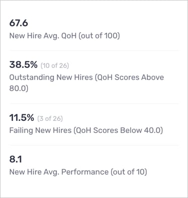
- What this report means: These KPIs are best considered together. The first KPI shows the average Quality of Hire while the second and third describe the distribution (noting how many new hires are at the tails of the QoH distribution). The fourth KPI shows average performance, which is always an input in QoH, so this highlights to what extent retention is pulling QoH down.
- Why it’s important: QoH balances hiring objectives, chiefly performance and retention, and can be used to measure the tradeoffs between these inputs. Since terminations are costly to QoH, it could be the case that the average QoH is mediocre despite there being a number of “Outstanding” hires. Such a situation implies that most new hires are performing well, but are also likely to churn.
- How to interpret apply it to your business: Ultimately, each organization must decide what they’re looking for in new hires. Of course, high performing and long lasting employees are ideal, however failing that, how much churn is an organization able to stomach to find the right employees for the job? Thinking at the cohort level, do some cohorts demand exceptional performance while others benefit from consistency and low churn?
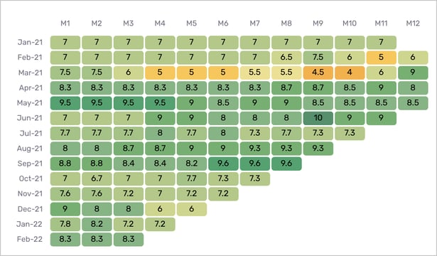
2. New Hire Quality of Hire Trend by Monthly Hiring Class
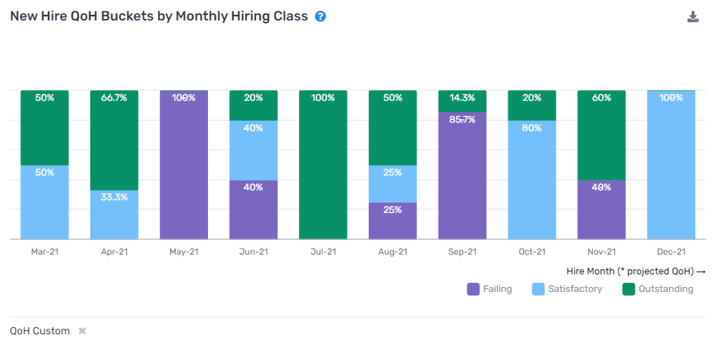
- What this report means: compares the QoH for all hiring month cohorts (within the larger cohort) by month of employment
- Why it’s important: this report helps you identify especially strong hiring cohorts and further, what process lead to that cohort outperforming others. It also identifies “pain points” within the new hire period.
- How to interpret and apply it to your business: First, visualize a simple process change and how that impacts QoH, looking at the figure above suppose a new approach was tried in August 2021 (adding a take-home exam for example), well then we could see that there is suggestive evidence that exam caused QoH to suffer. Second, if several hiring cohorts all have a substantial QoH drop at some point in the new hire period, then it suggests that the onboarding program could use some work, perhaps there is not enough training so performance suffers, or there is not enough employee engagement so retention suffers.
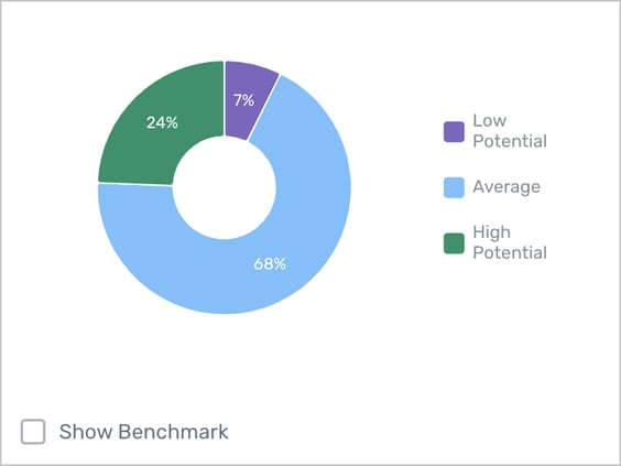
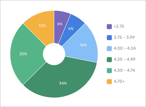
3. New Hire Quality of Hire Distribution
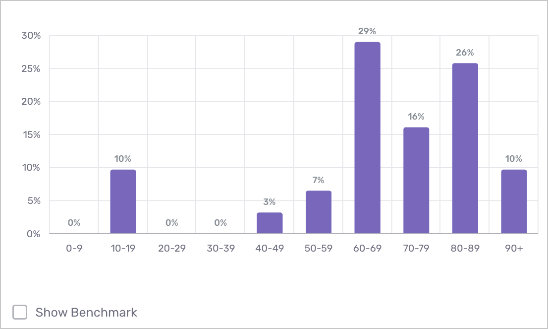
- What this report means: Quality of Hire distribution for new hires in period, a more visual representation of the KPIs described on the previous report.
- Why it’s important: this report provides a quick and easy visualization to get a sense of the QoH distribution shape. The figure above shows a bimodal distribution. At a high level, you hope to see QoH distribution skewed to the right.
- How to interpret and apply it to your business: similar to the previous report, you can use this report to understand QoH distribution of the current cohort. Here we would likely attribute the 10% blip at a QoH of 10-19 to churn, while the blips at 40-49 and 50-59 could either be high performers churning or consistently average (or slightly below) performers. Further analysis would be needed to dig in there.
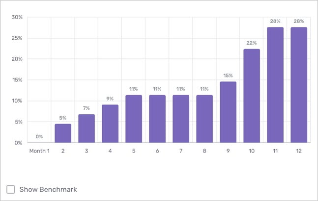
4. New Hire Quality of Hire Trend
-png.png?width=617&name=New%20hire%20QoH%20Trend%20(1)-png.png)
- What this report means: Quality of Hire, retention, and average performance (indexed to 100) by month of employment over new hire period.
- Why it’s important: This figure is important in understanding specifically which input is driving changes to QoH. Since QoH is a function of retention and performance, and retention (thought of cumulatively) cannot increase, this shows the horserace between performance and retention. In the figure above, performance generally increases from about month 3, offsetting the terminations to result in a slight QoH improvement at month 11
- How to interpret and apply it to your business: Thinking broadly about the tradeoffs between QoH inputs, you can use this report to identify the input that is driving QoH the most and create a strategy around improving that metric (i.e. further training/onboarding to improve performance, 6 month retro with comp renegotiation to address retention, etc.)
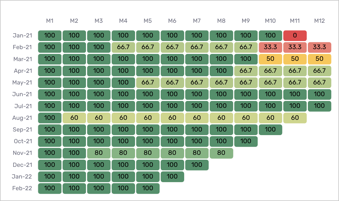
5. New Hire Quality of hire Trend by Monthly Hiring Class (Grid)
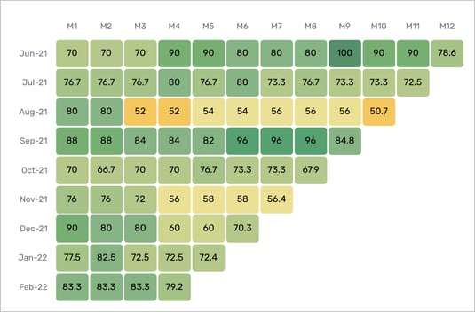
- What this report means: Quality of Hire by month of employment over new hire period, grouped by monthly hiring class. This report is displaying the same data as report #2, visualized differently to allow you to analyze the QoH of a greater number of hiring month cohorts more clearly. You can also hover over each data point to see the "n" population count showing how many employees make up each hiring class.
- Why it’s important: this report helps you identify especially strong hiring cohorts and further, what process lead to that cohort outperforming others. It can also help identify “pain points” within the new hire period.
- How to interpret and apply it to your business: similar to report #2, you can use this report to understand how initiatives, such as onboarding or enablement process changes at certain points in time, impact QoH over the lifecycle of your different hiring classes.
6. New Hire Quality of Hire Trend by Diversity Group
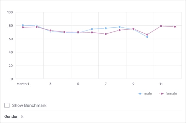
- What this report means: Quality of Hire by month of employment over new hire period by diversity group. Using the filter at the bottom, you can toggle diversity group between Gender, Ethnicity, and Age.
- Why it’s important: QoH and its inputs should not be a function of demographic inputs. Such a situation implies that certain groups are not being treated equitably in the workplace. The conclusion is NOT that one diversity group performs better or is more reliable than another, but rather that processes in place could be leading to lower performance or increased churn.
- How to interpret and apply it to your business: Look for differences across groups and if found, talk to team members to better understand what could be happening.
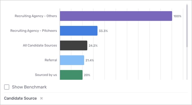
7. New Hire Quality of Hire by Employee Segment
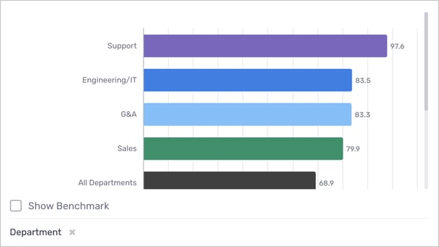
- What this report means: average Quality of Hire of new hires in period by employee segment. This report highlights which employee segments have the highest and lowest average QoH. Using the filter at the bottom, you can toggle employee segment between Department, Candidate Source, Recruiter, and Division.
- Why it’s important: Use this report to identify segment leaders and laggards to learn from the former and help the latter.
- How to interpret and apply it to your business: First, acknowledge which employee segments might be more difficult to hire for and where additional resources might be needed. Second, what are high QoH employee segments doing from a training/employee retention perspective? Use this information to inform potential changes that could be applied to bring up the QoH of lower performing segments.
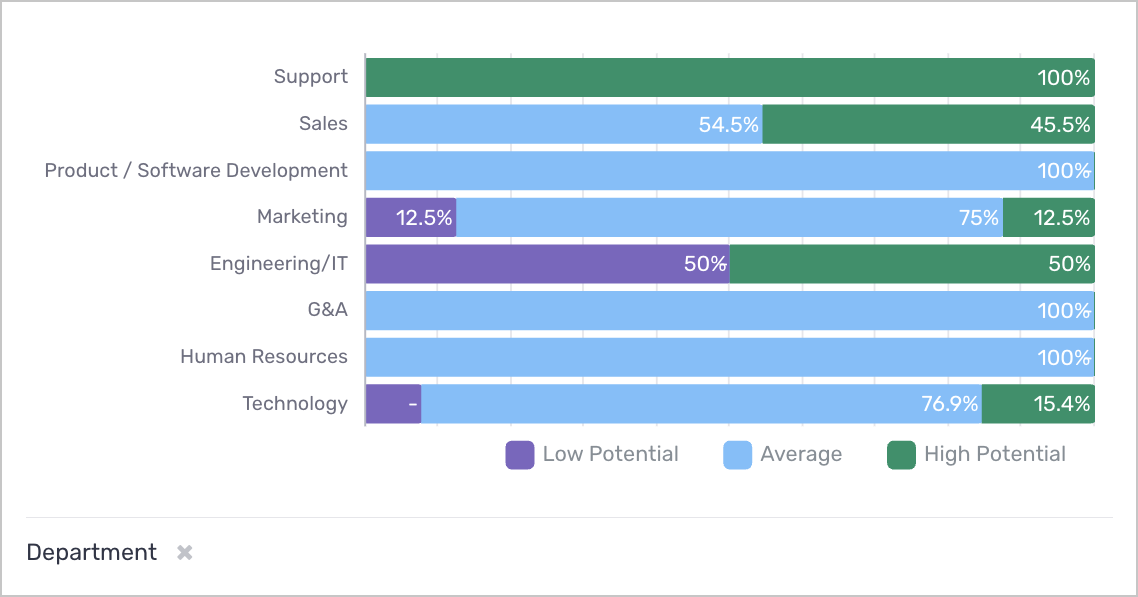
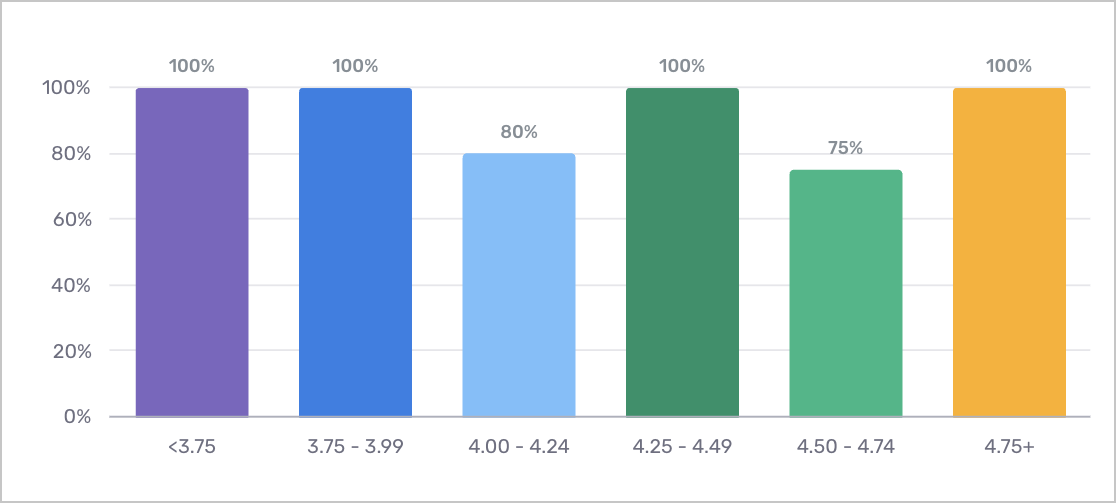
8. New Hires by Quality of Hire Group, Percent of Employee Segment
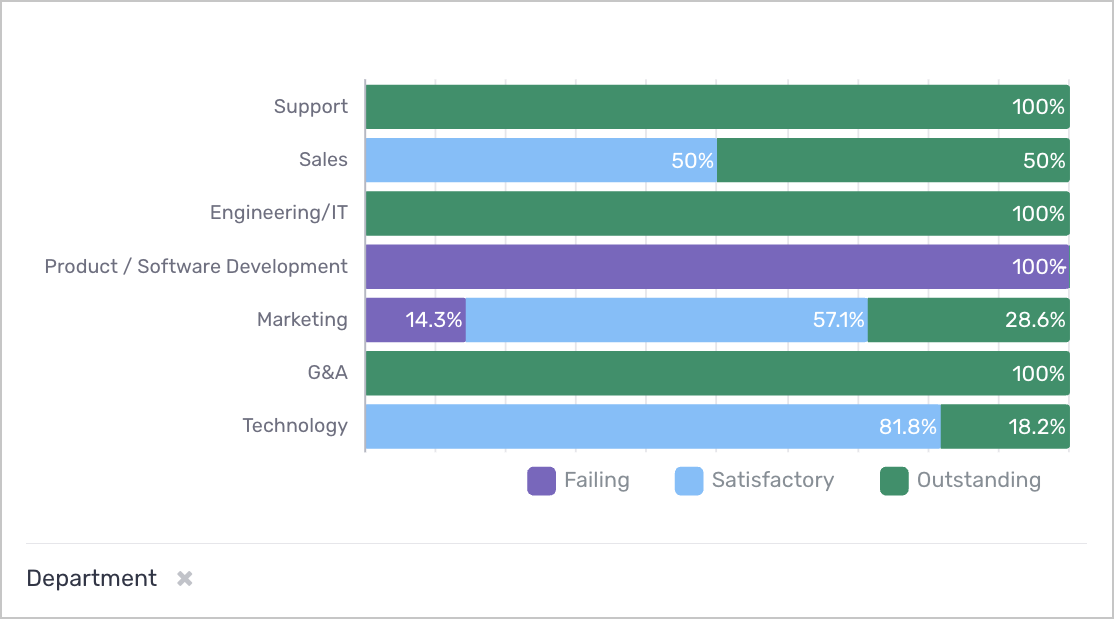
- What this report means: Categorical Quality of Hire distribution for all new hires in period, grouped by employee segment. Using the filter at the bottom, you can toggle employee segment between Department, Candidate Source, Recruiter, and Division. QoH categories are calculated as follows:
- Outstanding: QoH score of 80.0 and above
- Satisfactory: QoH score between 40.0 and 80.0
- Failing: QoH score of 40.0 or below
- Why it’s important: This component (unlike report #7) focuses on the distribution of QoH and allows the user to think about what mix is ideal for each employee segment. Use this report to identify employee segments that have a large proportion of “Failing” new hires and devote more resources to them. Conversely, learn from those with many “Outstanding” new hires.
- How to interpret and apply it to your business: This information can be used to inform top-level resource allocation and where hiring and L&D teams need to zero in on to improve performance across segments. Looking specifically at the example above, it could be the case that the 14.3% “Failing” new hires are really hurting the Marketing department, and while the Technology department has relatively fewer “Outstanding” new hires it’s actually been able to hit deadlines and launch several new features.
Performance
1. Performance KPIs
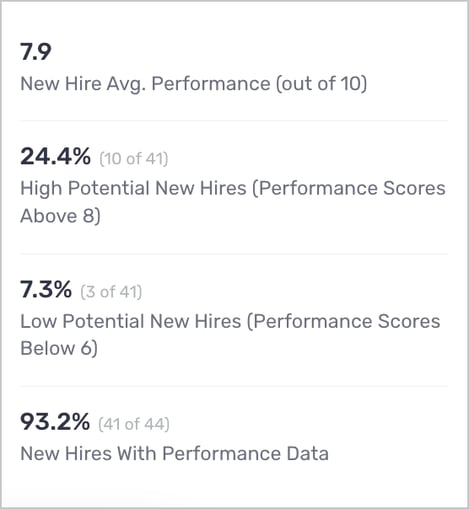
- New Hire Average Performance (out of 10): These KPIs are best thought of together, since the first three jointly describe the distribution of performance. This one is the straight up average performance value across the cohort.
- High Potential New Hires (Performance Scores Above 8): This and the following KPI describe how many new hires are in the top and bottom performance groups respectively. If an organization has lots of top and bottom performers, they should do a deeper dive to understand the differences between those groups.
- Low Potential New Hires (Performance Scores Below 6): See above.
- New Hires With Performance Data: To accurately describe a cohort’s performance we need as much information as we can get. Therefore, if this number is less than 100% perhaps some managers need to be pushed to complete their Voice new hire performance surveys.
2. New Hire Performance Trend by Monthly Hiring Class
-png.png)
- What this report means: Average performance by month of employment over new hire period, grouped by monthly hiring class. Like the other timeline by hire month components, this is useful to look at the impact of a policy change to compare the cohorts before and after that change.
- Why it’s important: If we add an additional training to one hiring cohort at month 6 and we observe that their performance increases, this does not necessarily mean that the training was effective. It could be the case that all other cohorts experience a performance improvement at month 6 as well. To get around this issue we compare hiring cohorts just before and just after a change, using the first hire month as a control.
- How to interpret and apply it to your business: Organizations don’t want to take up time with a training session if it’s not effective. As well, changes to hiring processes can lead to higher performing new hires, however changes must be measured and analyzed to ensure they have the desired effect.
3. New Hires by Performance Group, Percent of Total
- What this report means: Performance group distribution for all new hires in period. This component provides a simple and easy to report measure of the performance of new hire cohorts.
- Why it’s important: Qualitative metrics such as these can be more intuitive to some users. As well, they give a view of the performance distribution. Some organizations need consistent solid performance, while others benefit greatly from a few high performers. Of course, an organization will want all “High Potential” but such a situation is likely infeasible or at least expensive.
- How to interpret and apply it to your business: As an organization, this report could be applied to keep tabs on the rates of “Low Potential” new hires and seek to further understand why this might be the case.
4. New Hire Turnover Rate by Performance Group
- What this report means: Turnover rate for all new hires in period by performance group. This figure works to answer the question, are high performing new hires churning at a higher rate than other new hires?
- Why it’s important: Organizations want to keep top talent, if high potential new hires are under stimulated by their work or feel their growth is limited they are likely to churn.
- How to interpret and apply it to your business: A churn problem is bad, but a churn problem limited to top talent is worse. If that is indeed the case, then an organization should evaluate the work given to new hires and determine whether or not its challenging/interesting enough to keep high performers.
5. New Hire Experience by Performance Group
- What this report means: Average new hire experience for all new hires in period by performance group. This component is related to the component on the previous slide. It seeks to better understand the differences between performance groups. This figure effectively asks whether performance and employee experience are correlated.
- Why it’s important: One would hope that High Potential new hires are enjoying the work and their experience is positive as a result.
- How to interpret and apply it to your business: Using the example in the component above, we see that Low Potential new hires are having a great time while Average and High Potential new hires are having an ok to poor time. This is a problem that could result in churn for those high performers. It also raises the need for additional analysis into why Low Potential hires are rating their experience much more favorably than their higher performing peers.
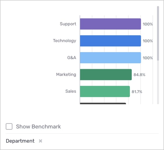
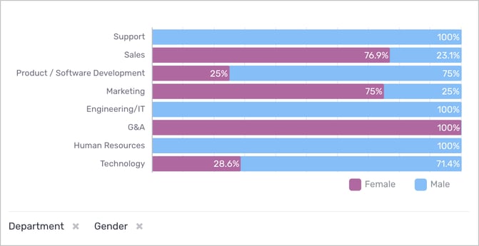
6. New Hire Performance by Employee Segment
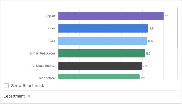
- What this report means: Average performance for all new hires in period by employee segment. This component highlights the top and bottom performing employee segments, and displays them relative to the company average. Using the filter at the bottom, you can toggle employee segment between Department, Candidate Source, Recruiter, and Division.
- Why it’s important: As per usual, learn from those that are performing well and seek to make changes to those that are not performing well.
- How to interpret and apply it to your business: When looking at this figure, one should consider overall business performance. If say the Support department is being scored highly in Performance but are missing all of their goals for the quarter then there could be a problem. But with that in mind, if the Support and Sales teams really are crushing it, then schedule some time with managers on those teams and try to understand what they’re doing that could be emulated on teams that are not performing as well. Furthermore, recruiters should use this information to assess job requisitions and interview questions for certain roles. If performance on the Technology team is worse than average perhaps recruiters are not selecting candidates with the right skillset.
7. New Hires by Performance Group, Percent of Employee Segment
- What this report means: Performance group distribution for all new hires in period, grouped by employee segment. Similar information presented as the previous component, however, this displays the qualitative distribution of performance groups. Using the filter at the bottom, you can toggle employee segment between Department, Candidate Source, Recruiter, and Division.
- Why it’s important: Same reasons as the previous component, with the addition of trying to get a sense of what distribution yields the best results for each employee segment (given a fixed budget).
- How to interpret and apply it to your business: Looking at the above component, we can compare the Marketing department and the Engineering/IT department and see that most Marketing new hires are Average while Engineering new hires are split evenly between Low Potential and High Potential. Different departments will have different needs and methods of evaluating performance so understanding these differences in the context of overall department performance is important. Recruiters should use this information to understand how to balance the tradeoff between quality and quantity when hiring for different roles.
8. New Hire Performance Trend
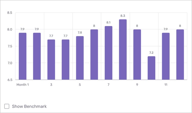
- What this report means: Average performance by month of employment over new hire period.
- Why it’s important: Simple view that clearly identifies trends and dips in performance to uncover pain points if there are any.
- How to interpret and apply it to your business: Look for points at which performance drops and think about a training or check in to get back on track. As well, comparing to the benchmark gives a sense of how your organization is performing relative to others.
9. New Hire Performance Trend by Monthly Hiring Class
- What this report means: Average performance by month of employment over new hire period, grouped by monthly hiring class. This report is displaying the same data as report #2, visualized differently to allow you to analyze the performance of a greater number of hiring month cohorts more clearly. You can also hover over each data point to see the "n" population count showing how many employees make up each hiring class.
- Why it’s important: this report helps you identify especially strong hiring cohorts and further, what process lead to that cohort outperforming others. It can also help identify “pain points” within the new hire period.
- How to interpret and apply it to your business: similar to report #2, you can use this report to understand how initiatives, such as onboarding or enablement process changes at certain points in time, impact performance over the lifecycle of your different hiring classes.
10. Top Performers
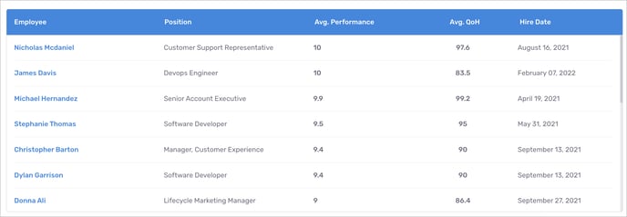
- What this report means: Top performing new hires in period, ordered by decreasing Quality of Hire. (Note: displays a max of 50 new hires.) Click on their names to view their employee profiles for more information.
- Why it’s important: Keep tabs on to performers and identify managers that are best able to nurture new hires. Looking at their employee profiles and speaking with managers of these individuals can help inform your ideal candida.
- How to interpret and apply it to your business: Reward top performers with a salary renegotiation and or discussions of growth opportunities to improve retention. As well, reward managers that build effective teams.
Turnover & Retention
1. Turnover KPIs
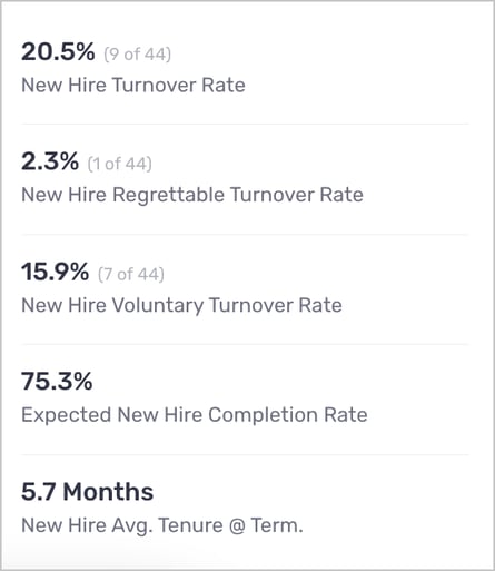
- New Hire Turnover Rate: simple metric of how many new hires have left over the number that have been hired (does not take into account tenure at all)
- New Hire Regrettable Turnover Rate: subset of the “New Hire Turnover Rate” to be viewed in context of the first KPI, high turnover values are bad, but worse are high values of regrettable turnover
- New Hire Voluntary Turnover Rate: subset of the “New Hire Turnover Rate”, high values of voluntary turnover relative to standard turnover could indicate a problem
- Expected New Hire Completion Rate: the expected probability that a new hire will complete their new hire period as of their first day of employment. This is different than the first KPI in that it takes tenure into consideration, i.e. a new hire who has worked for 1 month influences this metric less than a new hire who has worked for 11 months (despite both being in their new hire period). This metric is helpful in that it gives a more accurate view of an organization’s employee turnover. While the first KPI is descriptive, this KPI is predictive, using observed terminations to estimate the percentage of new hires that will complete their new hire period. (Note that this number is also a function of the new hire period set in Voice. Longer new hire period means less likely a new hire is to complete it.)
- New Hire Average Tenure at Termination: of those that have terminated, how long have they been employed on average. Different organizations might be looking for different things in this metric. Some might want to see values close to the new hire period length, suggesting that they were close to up to speed before terminating. While others could seek a low tenure thinking that if a new hire will terminate then we need not continue to train them before they leave. Ultimately, this metric reflects how long an organization thinks it takes to determine if a new hire is a quality long term employee.
2. New Hire Turnover Rate by Monthly Hiring Class
-
What this report means: Of each monthly hiring cohort, what percentage of hires have terminated as of the end of their new hire period (or today, whichever is sooner)?
- Why it’s important: Like the previous QoH trended view split by hiring month this figure can be used to compare hiring cohorts before and after a policy change. As well, if month 6 is a high churn month for new hires, this figure can overlay multiple hire months to show that change.
- How to interpret and apply it to your business: Imagine a new training program was launched in month 3 starting with the March cohort. We could then compare the Feb to March cohorts and see that the churn rate at month 3 is higher for Feb than March, suggesting that the training is successful. Of course future analysis is likely needed to better understand what might be happening here, and looking ahead to month 10 we see the difference in these rates narrow so maybe one training session is not the end of the story!
3. New Hire Terminations by Type & Disposition, Percent of Total
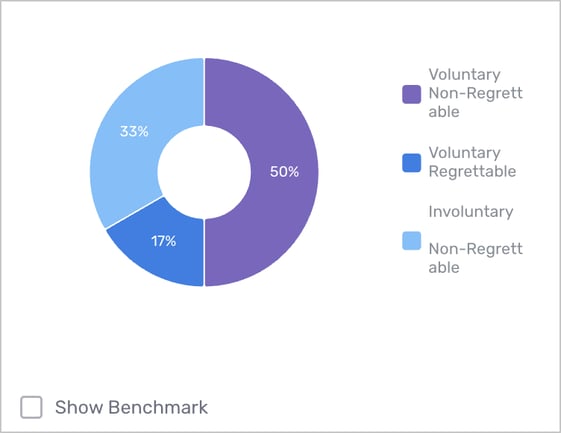
- What this report means: Distribution of termination type (voluntary/ involuntary) and termination disposition (regrettable/ non-regrettable) for all terminated new hires in period. What percentage of all terminations were voluntary/regrettable?
- Why it’s important: Voluntary/regrettable terminations have a different impact on business outcomes than involuntary and non-regrettable terminations. For one, voluntary and regrettable terminations likely catch the organization by surprise and leave holes in the workforce that need quick action on the part of the recruiter. As well, many non-regrettable/ involuntary terminations could show that the new hires are not strong enough while regrettable/voluntary terminations could indicate a culture issue whereby new hires are not having a positive experience.
- How to interpret and apply it to your business: As mentioned above, if there are lots of voluntary terminations consider asking for exit interviews and feedback to address the issues those new hires faced. Conversely, if there are many non-regrettable and involuntary terminations then check up on the job requisitions and hiring process to figure out what we might be missing. As per usual, further analysis is likely needed.
4. New Hire Terminations by Employee Segment, Percent of Total
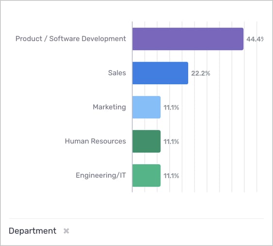
- What this report means: which employee segments are seeing the highest rates of new hire terminations? Using the filter at the bottom, you can toggle employee segment between Department, Candidate Source, Recruiter, and Division.
- Why it’s important: This report can be used by TA teams to understand where new hires might be needed based on recent terminations.
- How to interpret and apply it to your business: Using this information, talent acquisition leaders can stay informed on where recruiting efforts need to be focused. In this example, we would recognize that recruiting teams should focus in on backfilling vacancies in Product/Software Development. This could also prompt Product leadership to investigate the cause of higher turnover rates within their segment.
5. Expected New Hire Completion Rate by Employee Segment
- What this report means: The expected probability that a new hire will complete their new hire period by employee segment. This KPI is predictive, using observed terminations to estimate the percentage of new hires within a given segment that will complete their new hire period. Keep in mind this metric is a function of the new hire period set in Voice. Using the filter at the bottom, you can toggle employee segment between Department, Candidate Source, Recruiter, and Division.
- Why it’s important: The previous component does not normalize by team size, so it cannot be used directly to talk about a team’s ability to retain employees. This figure showcases expected new hire completion rates by segment which can be used to predict how many employees an organization can expect to retain within a segment at the end of the new hire period. This can be used to help inform a number of initiatives such as future headcount planning and understanding where across the business retention issues lie. The company average is also displayed for reference.
- How to interpret and apply it to your business: Users should ask whether those employee segments with high new hire completion rates are doing anything differently that could be emulated elsewhere. Conversely, is there something that those with low completion rates should stop doing or change?
6. New Hire Retention Rate by Monthly Hiring Class
- What this report means: Cumulative turnover rate by month of employment over new hire period, grouped by monthly hiring class. This report is displaying the same data as report #2, visualized differently to allow you to analyze the retention of a greater number of hiring month cohorts more clearly. You can also hover over each data point to see the "n" population count showing how many employees make up each hiring class.
- Why it’s important: this report helps you identify especially strong or underperforming hiring cohorts from a retention perspective, and further, what process lead to that cohort retaining employees more effectively than others. It can also help identify “pain points” within the new hire period.
- How to interpret and apply it to your business: similar to report #2, you can use this report to understand how initiatives, such as onboarding or enablement process changes at certain points in time, impact retention over the lifecycle of your different hiring classes.
7. New Hire Time to Quit Distribution
- What this report means: Distribution of tenure (in months) of terminated new hires in period. In what month of the new hire lifecycle are employees terminating?
- Why it’s important: see the note on the average tenure on the Turnover KPIs component, but the same logic applies here. Quick terminations are a problem, but at least an organization does not needlessly pay a salary. Late terminations are a problem as well, but that new hire was likely productive and added value. The middle ground is unlikely to be fruitful in any situation, unless it really does take that long to learn the company and contribute value to an extent to which a manager can realistically assess performance.
- How to interpret and apply it to your business: If you see peaks, look into those terminations and try to understand what the pain points might be. Knowing when in the new hire lifecycle employees are terminating can be useful in directing efforts to uncover the cause and implement changes. For example, on the graph above, we see that 44% of this cohort terminated employment during months 2 and 3. What are the underlying factors that lead to this early spike in churn for this segment? Is onboarding lackluster, or is there something more managers could be doing to set their employees up for success?
8. New Hire Average Tenure by Employee Segment
- What this report means: Average tenure (in months) of terminated new hires in period by employee segment. Using the filter at the bottom, you can toggle employee segment between Department, Candidate Source, Recruiter, and Division.
- Why it’s important: Different employee segments will have different expectations of new hires, some will take less time than others to get up to speed. One would hope to see the more “technical” groups have a longer average tenure since it’s more difficult to assess whether someone is performing well. For instance, Google estimates that it takes about 18 months for a new engineer to perform at the level of tenured employees. That does not mean that one cannot assess performance for 18 months, but it could mean that a strong employee will need to take the time to learn systems/processes before they can really shine.
- How to interpret and apply it to your business: Are the employee segments with high average tenure seen as having a more difficult onboarding experience and ramp up time? If not, this could indicate a problem.
9. New Hire Turnover Rate by Employee Segment
- What this report means: Turnover rate of new hires in period by employee segment. This report is similar to component #5 detailing Expected New Hire Completion Rate, whereas this report is descriptive as opposed to predictive. Using the filter at the bottom, you can toggle employee segment between Department, Candidate Source, Recruiter, and Division.
- Why it’s important: Similar to the takeaways from Expected New Hire Completion Rate, this report surfaces which segments are seeing the highest and lowest rates of turnover, which can be used to inform where recruiting resources need to be allocated as well as flag potential retention issues within segment.
- How to interpret and apply it to your business: Users should ask whether those employee segments with high new hire completion rates are doing anything differently that could be emulated elsewhere. Conversely, is there something that those with low completion rates should stop doing or change?
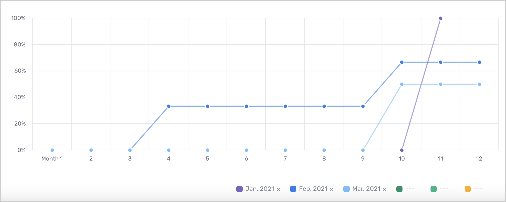
10. New Hire Turnover Rate, Trended
- What this report means: Cumulative turnover rate by month of employment over new hire period. With benchmarking enabled, the bars show your organization while the line series shows the benchmark.
- Why it’s important: Similar to report #7, New Hire Time to Quit Distribution, this component can be used to understand when employees are terminating across the new hire lifecycle, visualized in aggregate by month.
- How to interpret and apply it to your business: Look into trends where you see terminations increasing across the new hire lifecycle. In the figure above, why are we seeing a significant upward trend in months 9-11? This could be problematic as employees with greater tenure tend to deliver higher levels of productivity. What actions can be taken to reduce churn towards the end of the new hire period?
11. New Hire Terminations by Exit Reason, Percent of Total
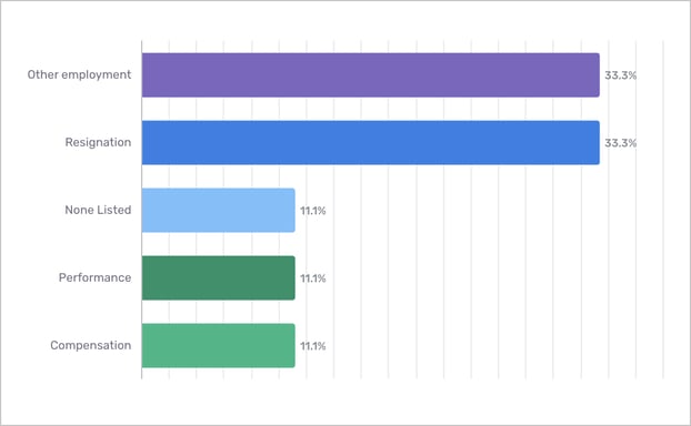
- What this report means: Distribution of termination reasons for all terminated new hires in period. What are the most frequent causes of employees leaving?
- Why it’s important: This report can be used to help build an effective exit interview, asking specific questions about new hires’ time at the organization and understanding their motives for leaving. Leaders can also leverage this information to implement changes that address the leading causes of churn.
- How to interpret and apply it to your business: In the example above, an exit interview would seek to understand what kinds of other organizations people are leaving for and what characteristics in particular were appealing to them.
Crosschq 360
1. Crosschq KPIs*
-4.png?width=380&name=image%20(2)-4.png)
-
*Terms such as variance, deviation, and correlation may be more easily understood by individuals with backgrounds or experience in statistics or data science, but we will do our best to explain these in laymen terms below:
-
QoH Variation Explained by Crosschq Survey Questions: if we were to predict QoH using only Crosschq 360 “compared to others…” survey questions, what percentage of deviations in QoH scores could we account for? Said more simply, this metric informs how much bearing should be placed on Crosschq 360 survey questions when making hiring decisions. In general, an ideal range of QoH variance explained is between 10-20%, which indicates that guiding hiring decisions with 360 responses has the potential to increase QoH scores. A percentage below that range indicates that 360 questions are not highly predictive of QoH. Higher than this range would indicate that that the model is "overfit", or being inflated by a small sample size.
-
Correlation Between Crosschq Self and Reference Scores: This KPI compares overall reference score to overall candidate score. High values could indicate that candidates are self aware, while negative values indicate that candidates are not very self aware.
-
New Hires with Fraud Detected in References: simple metric indicating how many candidates were flagged for fraud. Note that some of these flags could potentially be a false positive, i.e. a situation where a candidates’s references work in the same building and fill out the survey independently but on work machines.
-
Most Common Crosschq Survey: Are the right surveys being used for the cohort? For example, if you select the engineering department but the top survey is not “Engineer” perhaps this is a setting that needs to change. After doing so, one could look towards the first KPI to see if that had a noticeable impact on QoH.
2. Crosschq Survey Questions Most Predictive of QoH
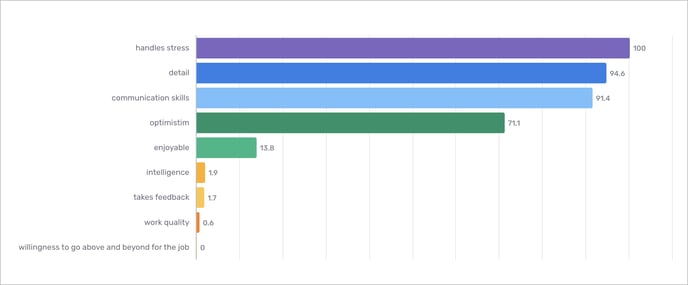
-
What this report means: Using linear regression modeling, this component highlights which Crosschq survey questions are most predictive of Quality of Hire, indexed between 0 and 100. The first KPI on the previous image notes the overall QoH variation explained by 360 “compared to others…” questions, which should be taken into account when looking at this chart.
-
Why it’s important: When looking at a completed 360 candidate report, each survey question is weighted equally in the overall “reference score” to make it a universal metric. However, each organization is different and it could be the case that “attention to detail” is more important than “takes feedback” when choosing a candidate, and this report attempts to inform that decision.
-
How to interpret and apply it to your business: The above figure suggests that as a recruiter/hiring manager, if you are facing a decision between two candidates that are basically identical except one has higher scores on “handles stress” but lower scores on “willingness to go above and beyond for the job” then that candidate should be chosen over the other (if your QoH Variation Explained by Crosschq Survey Questions is within the healthy range of 10-20%)
3. New Hires by Crosschq Score
-
What this report means: Distribution of Crosschq 360 reference scores for all new hires in period. Are we using Crosschq 360 reports effectively?
-
Why it’s important: if an organization is seeing a high proportion of candidates with Crosschq scores below 4, then they are likely not utilizing 360 as well as they could be.
- How to interpret and apply it to your business: extending on the previous point, in that situation a further analysis is likely needed to figure out if a) there are simply not enough candidates to choose from, b) hiring managers are not sure how to use the tool, or c) we're just using 360 to check a box.
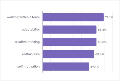
4. Top 5 Strengths
-
What this report means: Strengths most often associated with your new hire cohort per Crosschq 360 survey results, percent of all new hires in period.
-
Why it’s important: Similar to how individual 360 candidate reports can be leveraged as an onboarding guide, this component can be used by an organization to understand and acknowledge a cohort's strengths and play to them.
- How to interpret and apply it to your business: Looking specifically at the figure above, working within a team is the most common strength associated with new hires in this cohort, and this organization should work to make sure that new hires are not too siloed and have opportunities for collaboration.
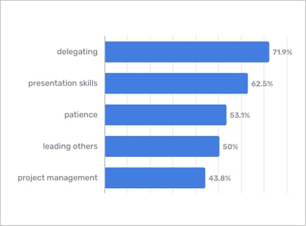
5. Top 5 Areas for Improvement
-
What this report means: Areas for improvement most often associated with your new hire cohort per Crosschq 360 survey results, percent of all new hires in period.
-
Why it’s important: Similar to how individual 360 candidate reports can be leveraged as an onboarding guide, this component can be used by an organization to understand and acknowledge a cohort's weaknesses and implement processes to overcome them or allocate work more effectively.
- How to interpret and apply it to your business: Looking specifically at the figure above, "presentation skills" are one of the most common areas of improvement associated with new hires in this cohort, and this organization could benefit from creating a training session around this topic.
6. New Hire Performance by Crosschq Score

-
What this report means: Average performance of new hires in period by Crosschq 360 reference score.
-
Why it’s important: This report attempts to answer the question; are Crosschq 360 scores correlated with performance? This can be used to further inform how effectively recruiters and hiring managers are leveraging 360 insights.
- How to interpret and apply it to your business: Looking at the above component, we see a slight upwards trend with higher Crosschq scores mapping to higher performance, however we also see the lowest Crosschq group having the highest performance. Further analysis is likely needed, but it could be the case that such low scores are more indicative of that candidate being a poor fit at their previous organization. In the future, recruiters and hiring managers should give a preference to candidates with higher Crosschq scores, with a caveat that very low scores likely warrant a closer examination. We don’t want to miss out on a strong candidate solely because a single reference of theirs was too harsh.
7. New Hire Retention Rate by Crosschq Score Range
-
What this report means: Retention rate of new hires in period by Crosschq 360 reference score.
-
Why it’s important: Similar to the previous component, this report attempts to inform: does a correlation exist between new hire retention and 360 score?
- How to interpret and apply it to your business: if, for example, lower Crosschq scores have lower retention rates, a recommendation could be made to further assess churn risk and company loyalty during the interview process for those candidates.
Recruiter Performance
1. Recruiter KPIs
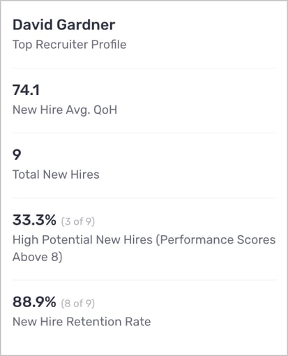
- All these KPIs work together to describe the top recruiter by average QoH of their new hires. The main idea here is that there is likely a tradeoff between New Hire Avg. QoH and Total New Hires (quality vs quantity). So we want to reward top recruiters and learn from them, however, if they are hiring only a few people then this result might not be as impressive upon closer review. Furthermore, we break down the QoH score further by describing the number of High Potential new hires as well as the retention rate.
2. New Hire Quality of Hire Trend by Recruiter
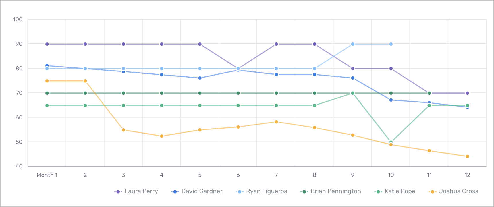
- What this report means: Shows the average Quality of Hire for all new hires in period by recruiter. (Note: displays top 6 recruiters by Quality of Hire.)
- Why it’s important: Traditionally, there has been very little data that provides recruiters with insight into how their hires have performed and retained after onboarding. This report attempts to rectify just that by allowing individuals and their managers to measure the average QoH of their hires over the course of the new hire lifecycle, which is impacted by both performance and retention. From a management perspective, users can leverage this information to understand which recruiters are best at identifying great fit candidates, and work with those individuals to disseminate best practices that can be emulated among other team members. Conversely, this report can be used to identify which recruiters may be struggling to hire high performing and well retaining candidates and work with them to implement training and best practices. Of course, the data never tells the full story without context, so additional conversations are always useful to understand trends.
- How to interpret and apply it to your business: Looking at the above figure we see that Joshua Cross has a stark QoH drop at month 3, this is likely attributed to retention issues among his hires so we should aim to do a deeper dive to understand what is happening. Is he hiring more for high turnover positions or is he not screening candidates well enough to get a sense of their potential as a long term employee?
3. New Hires by Recruiter & Performance Group
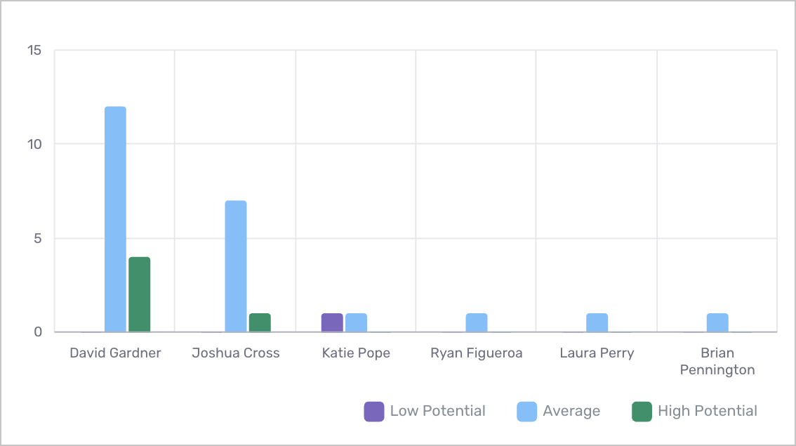
- What this report means: Count of new hires in period by performance group and recruiter. (Note: displays top 6 recruiters by Quality of Hire.)
- Why it’s important: As mentioned in the KPI notes, we are interested in exploring the tradeoffs between quality and quantity and this allows us to see if quality (in terms of performance) suffers as a recruiter does more hiring.
- How to interpret and apply it to your business: As an organization, recruiters should have a sense of their hiring goals both in terms of quality and quantity. This figure can serve as a guide to determine who should be hiring for what roles in that some recruiters may be better at high volume hiring. As well, if there are open positions that need to be filled immediately, this figure can give you a sense of how performance may suffer if you push your recruiters to hire more quickly.
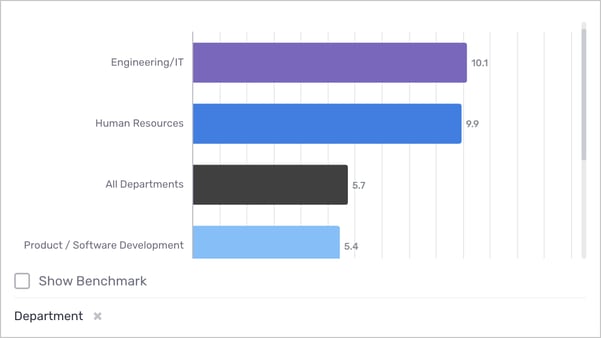
4. New Hire QoH by Recruiter
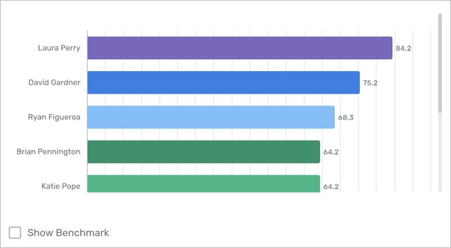
- What this report means: Average performance for all new hires in period by recruiter.
- Why it’s important: QoH balances these tradeoffs mentioned on the previous slides. Combining both performance and retention, this figure gives a high level view of which recruiters are bringing on the best talent.
- How to interpret and apply it to your business: As always, learn from those that are doing well and help those that are falling behind. Furthermore, if some recruiters are not doing as well, could they be hiring for more difficult positions or high turnover positions, in which case it might be necessary to check in with them and ensure they feel supported.
Diversity & Inclusion
1. Diversity KPIs
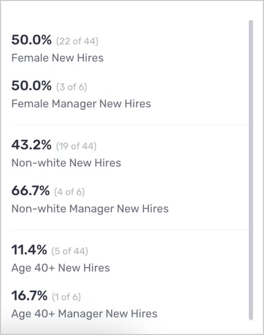
- These KPIs are metrics to understand the diversity of the new hire cohort. For each of the three diversity groups, we present both the percentage of all new hires and the percentage of managers. Organizations should compare these two metrics for each diversity group and ensure manager new hires are as diverse as individual contributors.
2. New Hires by Diversity Group, Trended
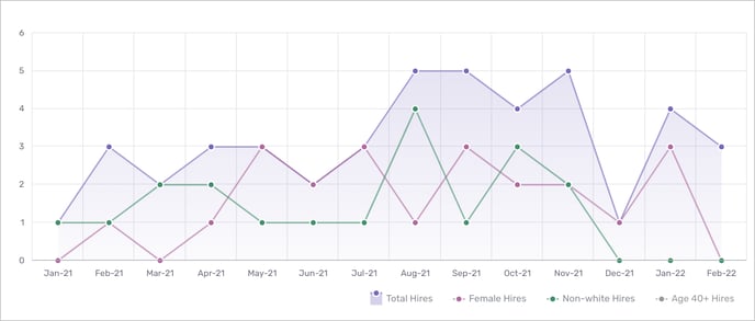
*You’ll notice that the diversity tab takes a different approach to showing trends over time. Other tabs put employment month on the x axis while the DEI tab puts hire month on the x axis.
- What this report means: Count of all new hires by diversity group and calendar month.
- Why it’s important: Allows the user to compare the overall number of hires to the number of hires from each diversity group. Note that the diversity groups are not mutually exclusive, and as such the combined number of “Female Hires” and “Non-white Hires” could be greater than the number of “Total Hires”
- How to interpret and apply it to your business: This figure is particularly useful in evaluating a change to hiring policies. For example, suppose a change was introduced in June 2021 that started candidates off with a phone screening instead of an in-person interview. This report can help us understand if such a change impacts the likelihood of bringing on diverse new hires.
3. Female New Hires, Percent by Organization Level
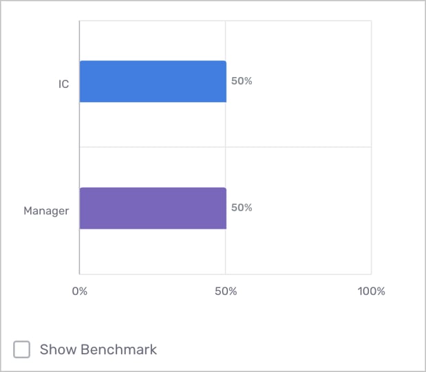
- What this report means: Percentage of female new hires in period by organization level.
- Why it’s important: For organizations with multiple organization levels (manager, director, etc.) this figure is helpful to understand the ratio of gender diversity at different levels of leadership.
- How to interpret and apply it to your business: If an organization does not put female new hires into management positions, then further analysis is needed to determine why that might be the case.
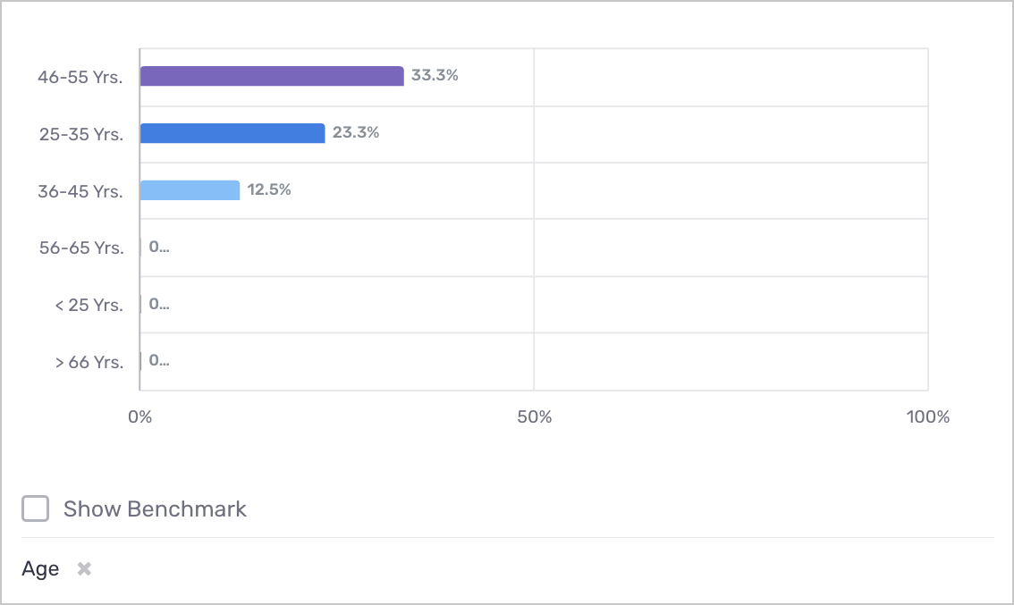
4. New Hires by Age, Percent of Total
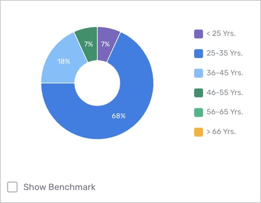
- What this report means: Age distribution of all new hires in period
- Why it’s important: Older employees have experience to bring to the team while younger employees might need more mentorship but may bring more enthusiasm. Ultimately, a cohort benefits from diversity and having multiple age groups represented.
- How to interpret and apply it to your business: A recruiter or hiring manager could use this information to see if certain age groups are underrepresented. It could be the case that a certain age group is absent because of company policies, i.e. 36-45 are missing because the work schedule is inflexible and those with children value that flexibility. Missing out on an entire age group makes it harder to find top talent so an organization should seek to ensure their policies reflect their needs and the needs of their (both current and future) employees.
5. New Hires by Ethnicity, Percent of Total
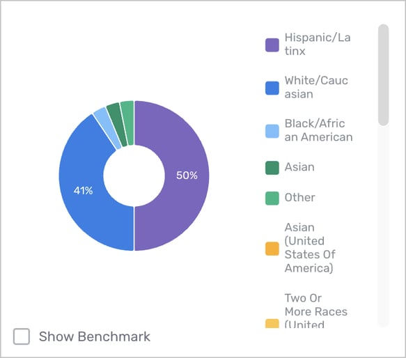
- What this report means: Ethnicity distribution of all new hires in period.
- Why it’s important: We want to build diverse, winning teams. If a certain diversity group is systematically missing then this can impact these goals.
- How to interpret and apply it to your business: If a certain group is underrepresented in an employee population, an organization could consider evaluating their hiring process to understand how unconscious bias could be playing a role.
6. New Hires by Diversity Group, Percent of Employee Segment
- What this report means: Diversity group distribution of new hires in period by employee segment. Similar to the previous figure, but this shows the percent of employees by diversity group within each employee segment.
- Why it’s important: The previous figure is biased by team size, i.e. it might not be a problem that the Engineering department only has 2.9% of all diverse new hires if it only has 2.9% of all employees. As such this component puts those results in context, showing relative percentages.
- How to interpret and apply it to your business: Identify departments that are lacking in diversity and seek to understand why. Is it an issue of not enough diverse candidates, or instead that the diverse candidates are not being hired, or perhaps they’re withdrawing their applications. Ultimately, missing out on a candidate pool is a problem that could hurt performance.
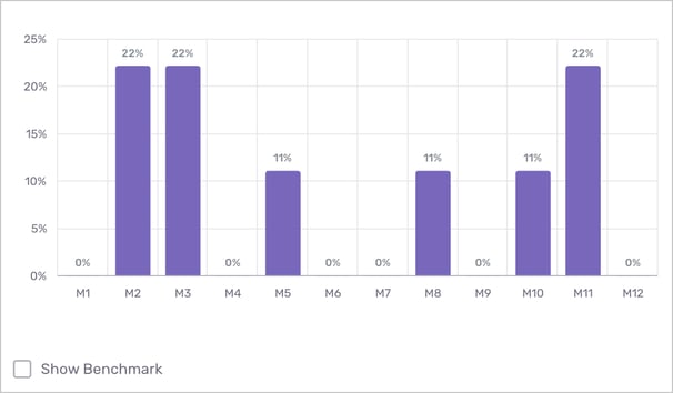
7. New Hires by Diversity Group, Percent by Monthly Hiring Class
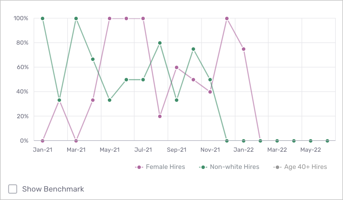
- What this report means: Showcases trends in diversity hiring over the date range selected.
- Why it’s important: If an organization underwent a policy change in an effort to boost diversity, this figure can be leveraged to evaluate the effectiveness of the change.
- How to interpret and apply it to your business: Looking at the figure above, if a change to the hiring process was introduced in November 2021 then we could see that the percentage of non-white hires went drastically down and that the change should be further evaluated. That said, if there are just a few hires in any given month then this figure will be sensitive to outliers.
8. New Hire Turnover Rate by Diversity Group
- What this report means: Turnover rate of new hires in period by diversity group. Using the filter at the bottom, you can toggle Diversity Group by Ethnicity, Gender, and Age.
- Why it’s important: This report helps to answer the question: how effective are we at retaining diverse talent? If we are seeing hire rates of termination among certain diversity groups, further analysis to understand the underlying cause should be done.
- How to interpret and apply it to your business: If turnover rates are noticeably higher for some diversity groups than others, then an organization might want to run an exit survey that seeks to understand if there is some aspect of company culture that is making new hires within this group churn.
Voice I
1. Voice Insights KPIs
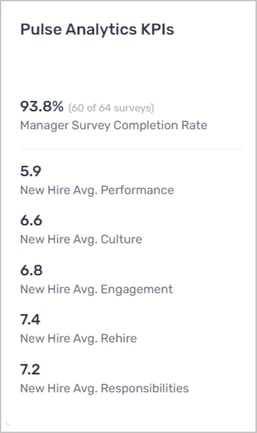
-
What this report means: These KPIs provide a jumping-off point to understand a cohort’s post-hire outcomes via Voice surveys. The first KPI shows the percentage of manager-conducted surveys that have been successfully completed, while subsequent metrics report average scores for each core Voice question.
-
Why it’s important: The value and usefulness of Voice depends on how effective it's being implemented. If only a few manager surveys are completed then the data will not be representative of your organization, and Insights will be limited. Furthermore, while the default Voice survey measures only Performance, we encourage a holistic approach to measuring quality, and suggest using the full Voice survey that includes additional questions. Together, these KPIs provide users with a snapshot of how well the module is being used, and serves as a useful reference when looking at other components.
-
How to interpret and apply it to your business: Users should look for high completion rates, as they show the commitment of managers to their new hires’ onboarding and growth. Low rates could suggest that managers do not understand the evaluations and a training session would be helpful. Ultimately, each organization must decide what scores they are satisfied with, and also how they expect these metrics to relate to one another. For example, the combination of high performance and low rehirability should raise concern and prompt further exploration.
2. New Hires by Voice Response Score
2a. Grouped by score buckets, and trended over calendar month
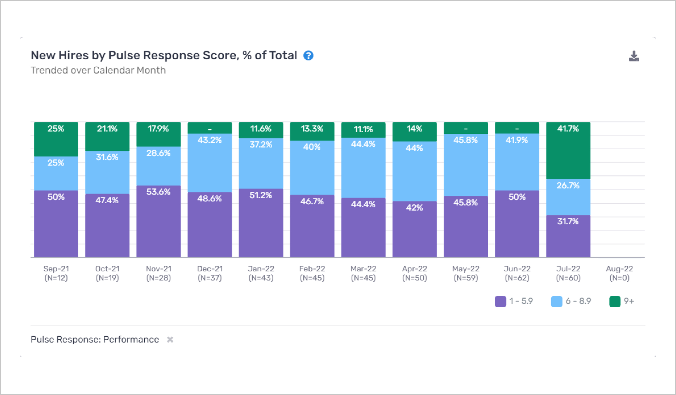
- What this report means: This component shows the distribution of Voice survey responses over time, with each calendar month corresponding to a unique Voice campaign. Each bar depicts the relative percentage of scores, where the total (cumulative) of each stacked bar always equals 100%.
- Why it’s important: This component was designed to spot high-level trends in how the distribution of responses changes over time. For example, suppose we observed that on the Performance tab the average performance value was constant over time. In such a situation, this component would indicate whether there were any underlying dynamics that wouldn’t change the overall average, such as an increase in both top and bottom performers.
Note: the use of relative percentages makes for a fair comparison since each Voice campaign could have a different number of new hires. - How to interpret and apply it to your business: This figure is particularly useful in evaluating efforts to boost culture/engagement, as well as workplace trainings. For example, suppose that in January 2022 this organization conducted an offsite meeting aimed at remote workers. This report can help us understand how Voice responses were impacted by the event, and for how long we saw a sustained effect. With that in mind, we can consider whether that offsite training was worth the expense and adapt future offsites to address shortcomings.
2b. Grouped by Survey Question
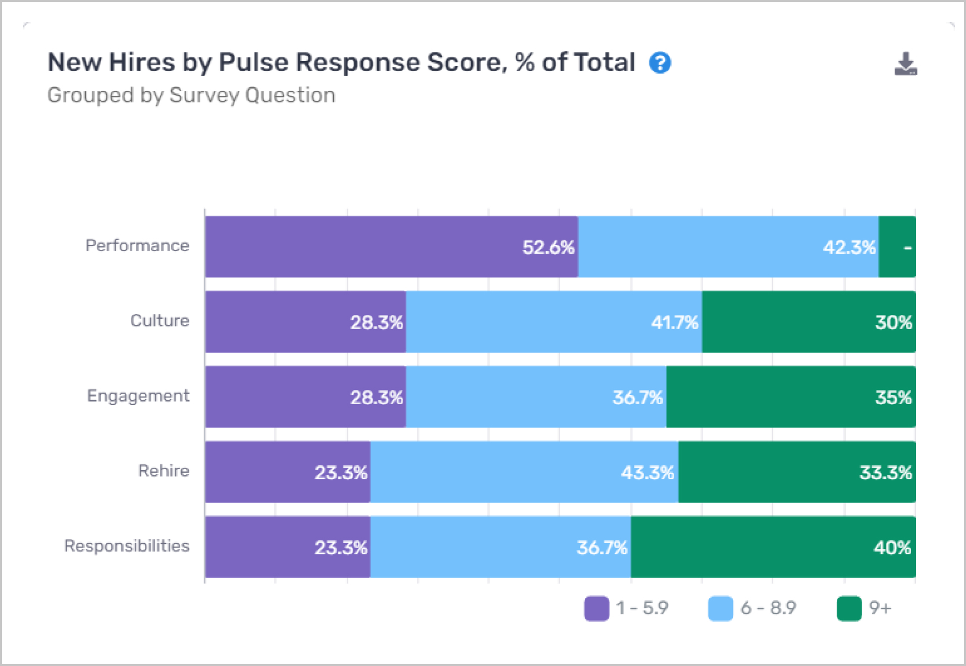
- What this report means: This component shows a side-by-side view of the distribution of responses for each Voice question in the full survey. Each horizontal bar shows quantitative groupings for each question, where the total (cumulative) of each stacked bar always equals 100%.
- Why it’s important: Viewing these questions in tandem allows us to flag anomalies. Situations in which there are lots of high performers but relatively few new hires ready to take on more responsibilities should raise questions about the onboarding process.
- How to interpret and apply it to your business: Broadly, identify the input that is being assessed with low scores and create a strategy around improving that metric (i.e. further training/onboarding to up performance, review compensation plans to improve engagement, etc.)
3. New Hire Avg. Voice Response by Survey Question
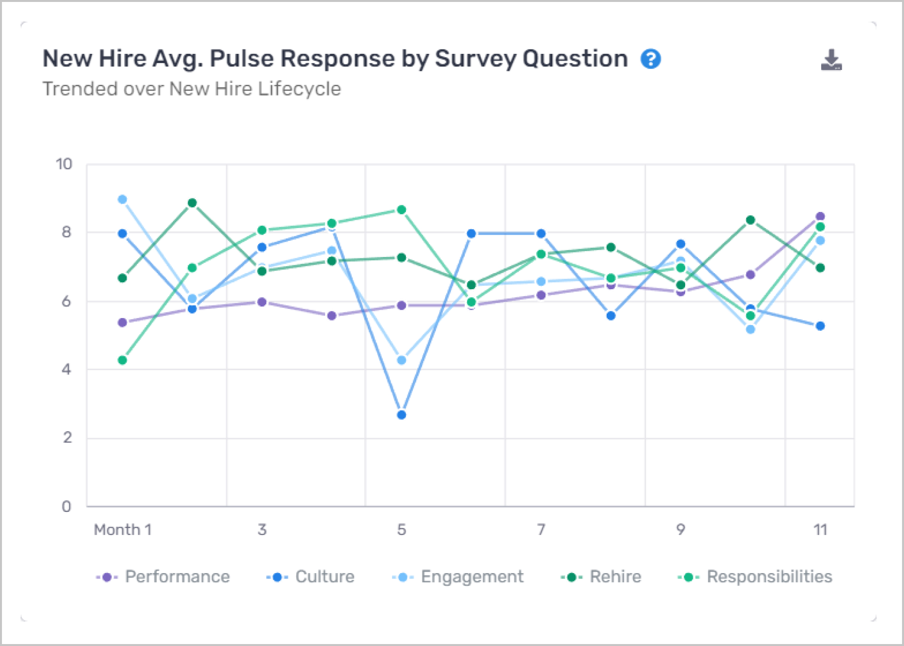
- What this report means: This component expands upon the “New Hire Performance Trend” component from the Performance tab, showing the average score of each Voice input over the New Hire Lifecycle. You can click the data labels at the bottom to choose what is displayed for better clarity.
- Why it’s important: As performance is correlated with other Voice responses, in many cases these other questions can explain likely drivers of changes to performance. More engaged employees are likely to perform better, and employees who have problems with the culture are likely to perform worse. This component does a deeper dive into the potential pain points identified in the Performance tab component, hinting at what could be driving changes to overall performance.
- How to interpret and apply it to your business: Suppose performance drastically drops on the 5th month of the life cycle along with engagement while all other inputs remain relatively constant. Then, the organization could speak with managers to understand what kind of engagement issues they are seeing and create an action plan to address these issues/concerns of new hires.
4. New Hires by Avg. Voice Response
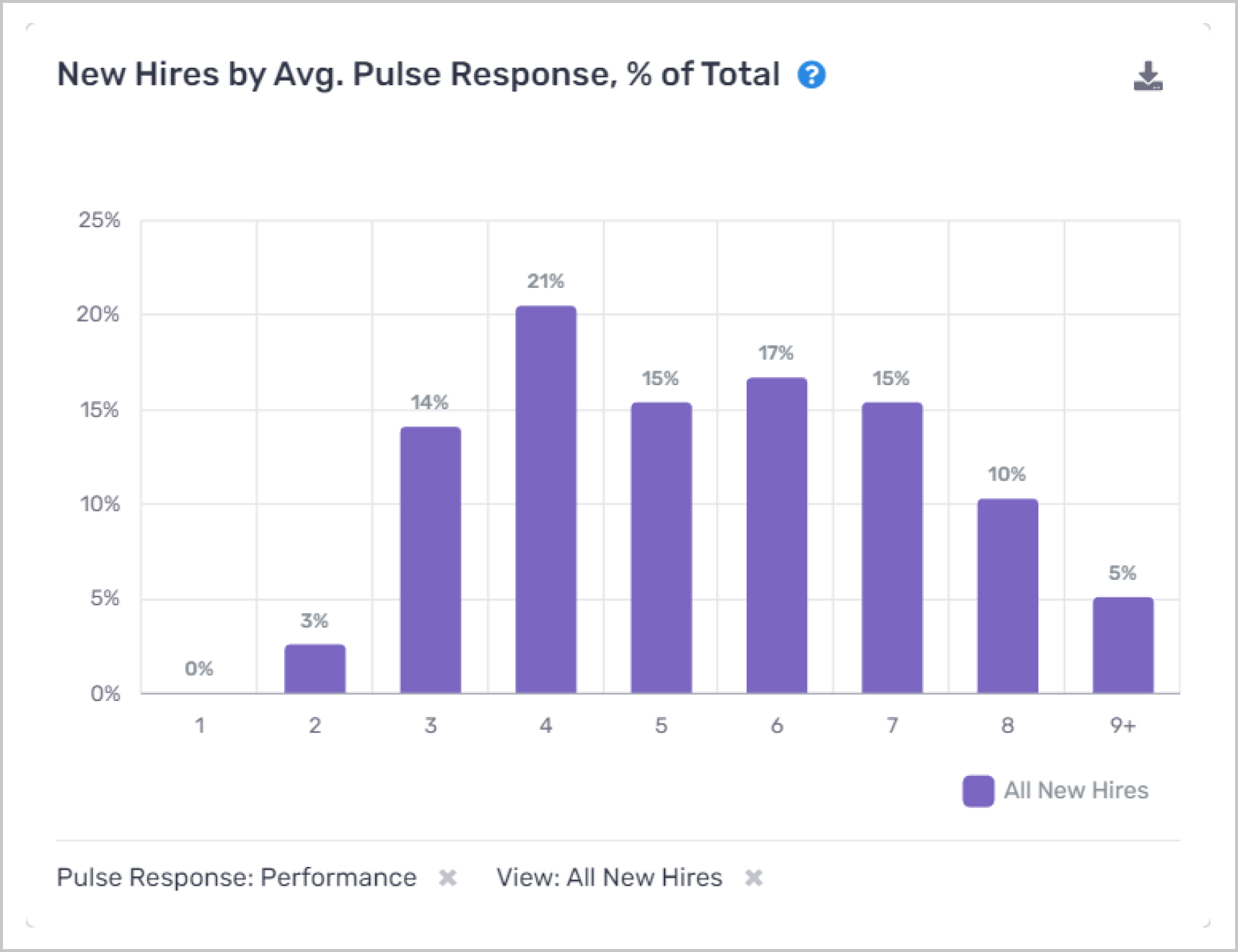
- What this report means: This component shows a more granular breakdown of the number of new hires by average Voice responses, showing only one Voice response compared to the “New Hires by Voice Response Score” component on slide 5.
- Why it’s important: One should look for a left-skewed distribution with relatively few new hires with low Voice response scores. As well, the “View” selector allows users to dive a bit deeper into the data, comparing the distributions of terminated new hires to employed new hires. Of course, we hope to see that employed new hires have higher scores on average, compared to their terminated counterparts.
- How to interpret and apply it to your business: Use this component to get a sense of what questions are most correlated with new hire churn. If the distributions of terminated and employed new hires are identical in terms of Responsibility but very different in terms of Culture, then this is worth exploring. It could be the case that sudden drops in culture scores are leading indicators of churn and should be watched carefully by managers.
5. New Hire Avg. Voice Response by Hire Month
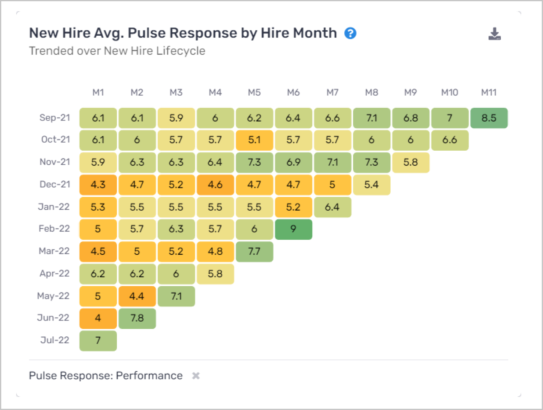
The data in this figure is identical to the 3. New Hire Avg. Voice Response by Survey Question component, however, this one goes one level deeper and shows all hire month cohorts for a single Voice question.
6. Manager Survey Completion Rate by Employee Segment
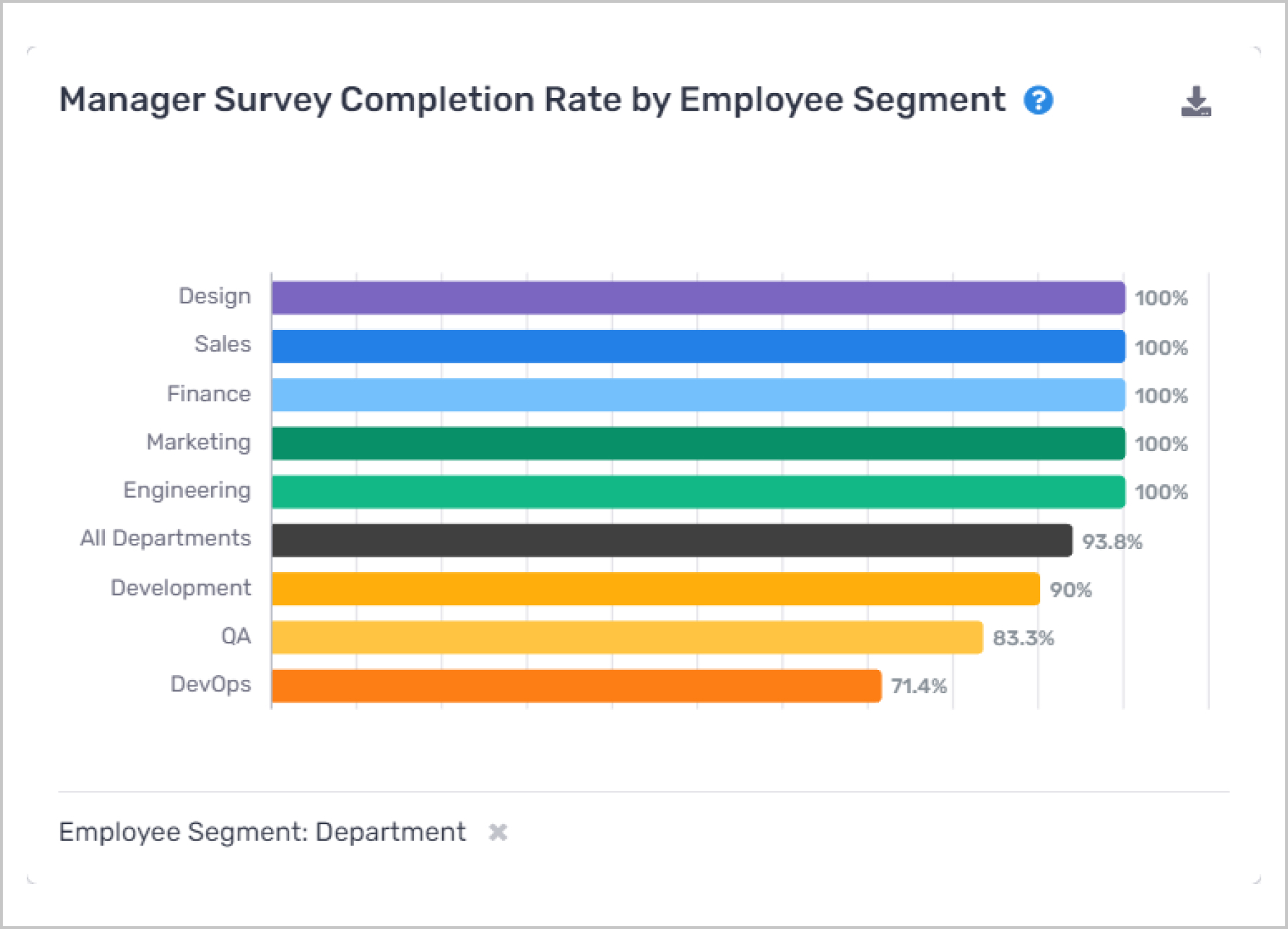
- What this report means: This component shows a more granular analysis of the Manager Survey Completion Rate KPI.
- Why it’s important: More data from across various employee segments yields a more representative view of an organization as a whole. Identifying departments in which Voice is not being used properly or as widely as expected is the first step in driving up usage.
- How to interpret and apply it to your business: Meet with managers in departments that are underutilizing the tool in an effort to figure out where the problem lies. Is it that they don’t understand how to use the tool, or rather that they don’t see its value? Either way, work with these managers to help them understand why Voice is being used in the first place. As well, if there are specific questions these managers feel are absent, consider including those as part of the pending survey builder tool.
7. New Hire Avg. Voice Response by Employee Segment
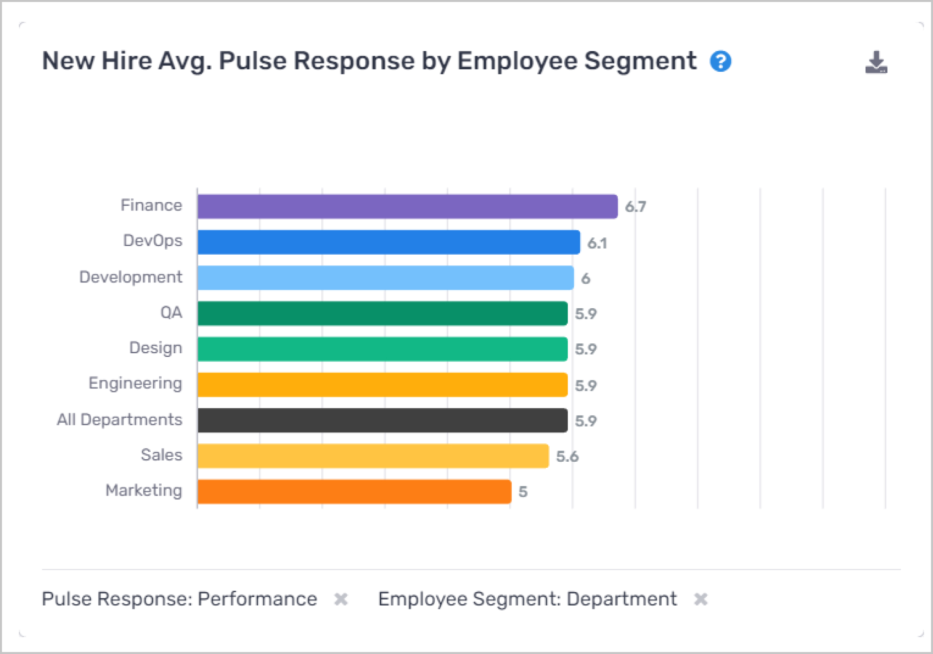
- What this report means: showcases the employee segment with the highest average score on the selected Voice measurement.
- Why it’s important: Gives the user a sense of which employee segments, department, etc. are doing particularly well (or poorly) by each Voice response.
- How to interpret and apply it to your business: Like a number of other components on this page (and the Insights module more generally), learn from the leaders to help the laggards.
8. New Hire Relationship between Avg. Voice Response and Avg. Rehire
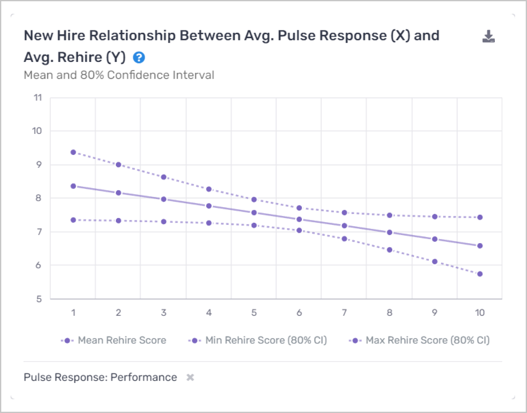
- What this report means: This component effectively shows the correlation between each Voice question and the Voice “rehire” question. In more detail, we see here a linear regression trend line that asks the question: for each average Voice response score, what would a new hire’s expected rehire score be? Each unit of observation is a single new hire, with each metric being the average managers' evaluations. The solid line represents the mean prediction, while the dotted lines represent the 80% confidence interval for that mean. One would read the above figure as: “we would expect a new hire with an average performance of 6 to have a rehire score of 6.5”. The overall slope of the line gives a sense of the sign of the relationship. In the above figure, we see that improved performance drives lower scores of rehirability.
- Why it’s important: At Crosschq we think about rehirability as being a little bit separate and distinct from other Voice questions. If a new hire scores very high on all questions, but low on rehirability, then something is up and further analysis is needed. Rehirability serves as a bit of a sanity check, if the aforementioned situation comes up, then it raises the question of what additional piece of information is missing from the survey. Clearly, managers seem to value something missing from the Voice questions and believe hiring decisions should be based on that feature. Moreover, it is the hope that new hires would have been rehired with the updated information they have today, and with that, we can get a sense of what metrics managers (and the organization more broadly) value most.
- How to interpret and apply it to your business: Organizations should identify which inputs are most correlated with rehirability and use that information as a starting point with which to build their custom QoH calculation. If managers find engagement more correlated with rehirability than performance then it should receive a higher weight. As well, this component serves as an example of the kinds of analyses that are possible with more extensive Voice data.
9. New Hire Retention Rate by Voice Response Score
- What this report means: This component explores whether average Voice responses are correlated with retention (for each Voice question).
- Why it’s important: we hope that high-quality new hires are less likely to churn than others.
- How to interpret and apply it to your business: Look for the Voice question with the most stark difference between top and bottom performers, such a question could be a leading indicator of churn and help managers retain their top new hires by intervening before they decide to leave. In all likelihood, further investigation is needed. Are the Managers accurately evaluating New Hires? Is the compensation plan the correct one?