The reporting screen allows users to view and interact with a range of graphs, including candidate averages, completion times, prospect opt-in rates, and more for deeper understand of Crosschq's data.
To access the reporting screen, click the Reporting tab within your Crosschq homepage.
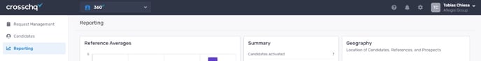
Below, we explain the information in each graph and how to adjust the settings/information.
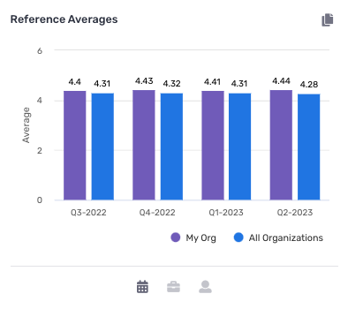
Reference Averages
The reference average graph displays the average reference data for your organization within a given time period and offers a comparison to other Crosschq organizations.
Additionally, you can sort the data by date range, survey type, and team member. The graph is dynamic so it will automatically update based on your selections from the drop-down menus.
If you would like to see only your organization's information, click My Org (the circle beside this label should turn purple). The same action can be repeated to see other organizations' data (in blue).
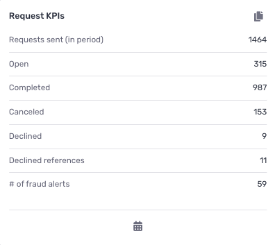
Request KPIs
The Request KPIs snapshot provides users with an overview of total request activity within a specific time period. By clicking the calendar icon at the bottom of the page, users can adjust the time frame and the data will automatically update.
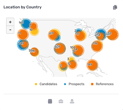
Location by Country
This graph shows users where candidates, references, and prospects are based geographically. This information can be further sorted by adjusting the time frame, survey type, and team member via the filter icons.
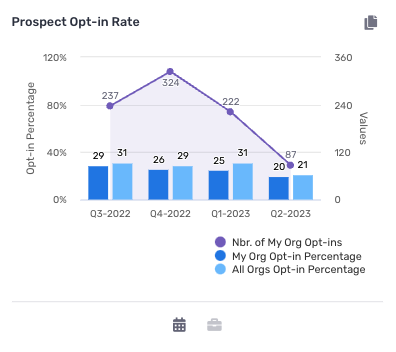
Prospect-Opt-in Rates
Within the Prospect Opt-in Rate graph, users can see opt-in information within a given time period and as compared to other organizations. To sort the data further, click on the specific percentages to view one organization at a time and use the drop-down menus to further filter by time and survey type.
To solely view your organization's information, click My Org Opt-In Percentage. The same action can be repeated to see other organizations' opt-in data.
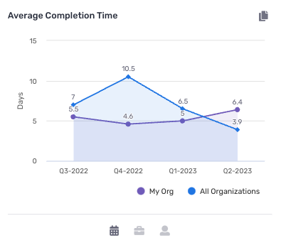
Average Completion Times
The Average Completion time graph allows users to get a sense of the average completion time for a Crosschq request as compared to other organizations. Users can filter via the icons at the bottom of the graph, or by clicking the legend to isolate the data sets.
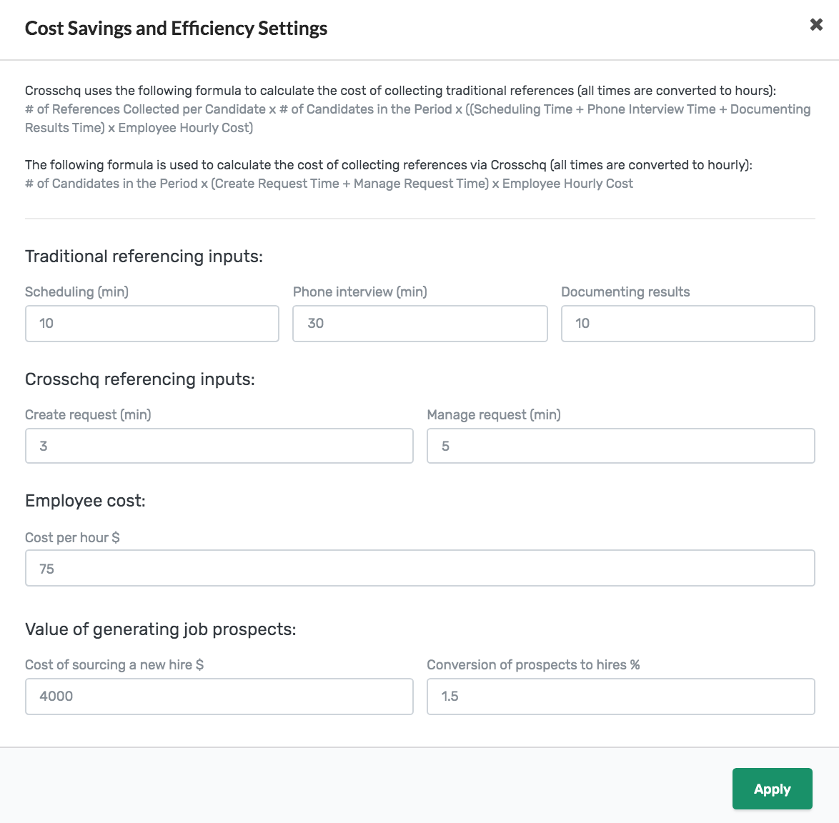
Cost Savings Analysis
The cost savings analysis graph is designed to illustrate the cost of a Crosschq request versus the cost of a traditional reference check. To customize the settings, click on the settings wheel in the far right corner.
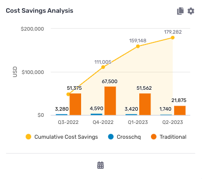
From there, enter the information in the form below to customize the analysis to your organization. Then you will be able to further sort by time period via the calendar icon at the bottom of the graph.
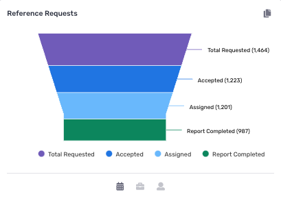
Reference Requests
The Reference Request graph displays information as it relates to all reference requests in your organization and their various statues. Here you can see the total number of requests requested, this is further segmented by request status so you can get a better sense of your internal progress. Finally, you can further sort the data via the icons at the bottom of the screen.
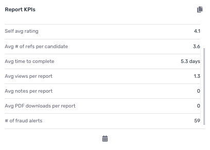
Report KPIs
The Report KPIs snapshot provides users with an overview of completed reference report metrics within a specific time period. By clicking the calendar icon at the bottom of the page, users can adjust the time frame and the data will automatically update.
Language Usage
This chart tracks the number of surveys that have been filled out by language. Click the legend labels to select and/or deselect which languages to include in the chart. Survey time frame can be updated by clicking the calendar icon at the bottom.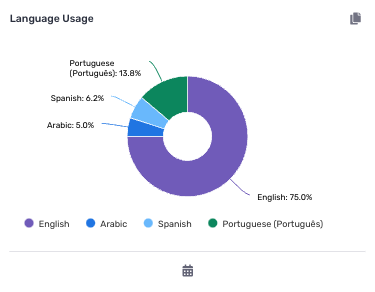
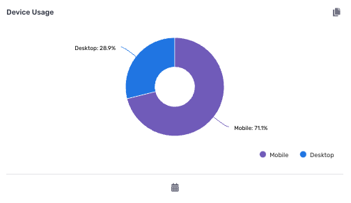
Device Usage
This chart tracks the percentage of surveys completed via desktop versus mobile device. Click the legend labels to select and/or deselect which device to include in the chart. Survey time frame can be updated by clicking the calendar icon at the bottom.
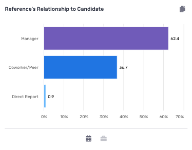
Reference Relationship to Candidate
This chart tracks the percentage of surveys created broken down by candidate relationship. Use the filter icons at the bottom to update the chart to a specific date range or survey.
Fraud Alerts
This chart allows organizations to keep track of their fraud alerts over time and compare them with the percentage of alerts across all Crosschq customers. Please note this chart only keeps track of same device alerts and doesn't include "Fraud Warnings" also known as same ip address alerts..png?width=374&height=375&name=image%20(156).png)
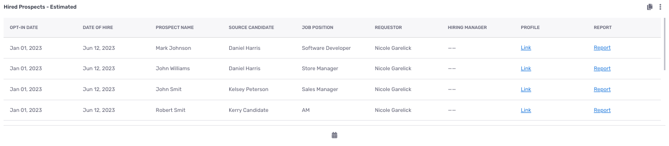
Hired Prospects (Estimated)
This chart tracks the candidates who opted in as a prospect and Crosschq has inferred have been hired by the organization. Users can choose what columns to appear in the chart by clicking the vertical ellipsis at the top right corner and selecting Customize Report. The ellipsis also provides an option to download the report as a CSV file. The calendar icon at the bottom allows users to filter by a specific date range.
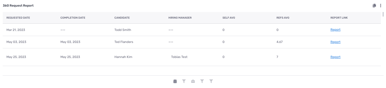
360 Request Report
This chart tracks all reference requests that were created. Users can choose what columns to appear in the chart by clicking the vertical ellipsis at the top right corner and selecting Customize Report. The ellipsis also provides an option to download the report as a CSV file. The icons at the bottom allow users to filter by date range, job position, survey, requestor, and request status.
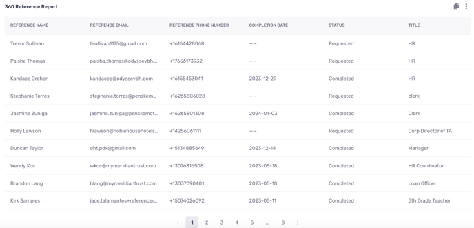
360 Reference Report
This chart tracks all references that have gone through a 360 request. Users can choose what columns to appear in the chart by clicking the vertical ellipsis at the top right corner and selecting Customize Report. The ellipsis also provides an option to download the report as a CSV file. The icons at the bottom allow users to filter by date range, job position, survey, and requestor.
Within the reporting section, you'll discover a comprehensive array of analytical tools comprising two tables and four graphs. These visualizations center around delivery, bounce, and open rates, for candidate and reference surveys..png?width=688&height=503&name=image%20(171).png)
To help you interpret these metrics effectively, here are some key definitions:
Email/SMS Delivered: Indicates a successful delivery when the recipient server accepts the message. Please note, that this doesn't guarantee the recipient has opened the message.
Email/SMS Bounced: This occurs when a message is rejected by the recipient server, often due to reasons like an invalid email address or a full inbox.
Email Opened: Recorded each time a recipient accesses the message.
Fraud Warnings
Presenting the "Fraud Warnings" chart, meticulously crafted to swiftly flag potential fraudulent activities for our users' attention. These alerts encompass instances such as when two or more references, or a candidate and a reference, share the same IP address while completing a reference survey. It's crucial to note that while these activities may raise suspicion, they don't inherently imply fraudulent behavior. Nonetheless, we strongly advise recruiters to verify the authenticity of surveys, ensuring they originate from the intended reference or candidate themselves.
Finally, for those with Insights, these updates are readily available within the "Reporting 360" template.