Crosschq Insights allows organizations to visualize and report on both pre-hire and post-hire data. It brings together inputs from Crosschq applications as well as integrations with your ATS and HRIS. With Insights, you can build collaborative dashboards that highlight KPIs across all Crosschq products.
This article will cover the following:
- Creating a new dashboard
- Dashboard homepage
- Chart features
- Dashboard features
- Employee profiles and data import
Creating a new dashboard
Dashboards are the foundation for organizing different charts and KPIs taken from Crosschq's applications.
From scratch
To create a dashboard from scratch, click Create Dashboard from the right side of your dashboard homepage.
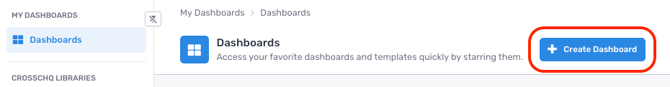
A new window will appear where you can enter a name and assign a color icon for the dashboard. Once selected, click Create.
Afterward, you will be taken to your new dashboard. At first, the dashboard will be empty. 
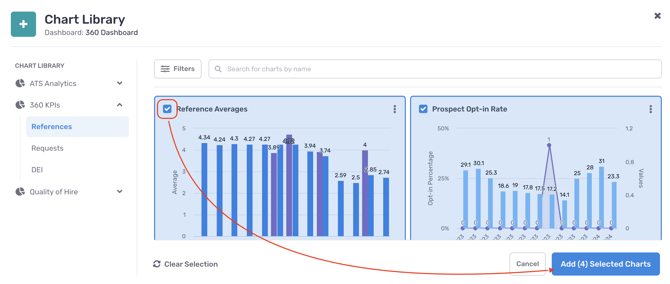
To add charts to your dashboard, start by clicking + Chart Library from the middle of the page.

A window will appear displaying all charts available to your org, organized by chart library. The libraries visible to you will depend on the Crosschq apps that have been purchased. To add charts to your dashboard, click the box at the top-left corner of each chart. Then, click Add Selected Chart.
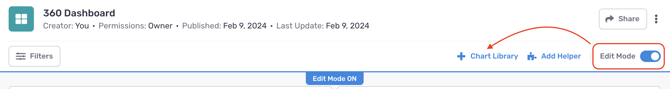
If you need to navigate back to the Chart Library, toggle on Edit Mode from your dashboard, and a Chart Library button will appear.
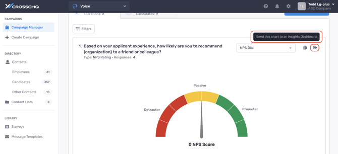
Charts can also be added outside of Insights from the reporting sections of individual Crosschq applications. For example, in the Campaign Manager section of Crosschq Voice, charts can be added to a dashboard by clicking the arrow icon associated with each chart.
From an existing template
On the left-hand menu, you will also find dashboard templates. Dashboard templates provide a pre-configured grouping of charts tailored to the respective user role. Templates save you time from having to build dashboards from scratch while still being fully customizable to add/remove/edit charts.
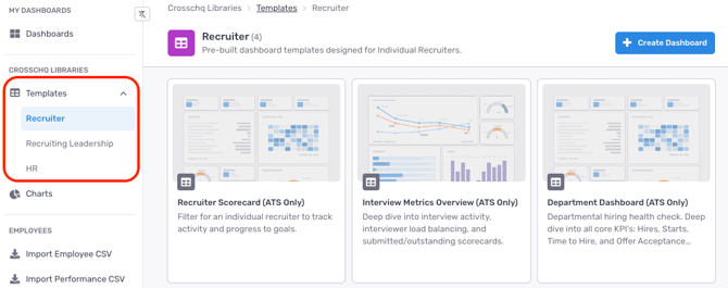
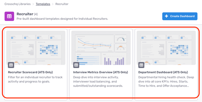
To create a new dashboard by leveraging an existing template, first click to view one of the templates from the tiles on the center of the page.
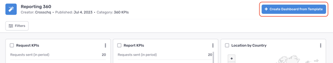
Afterward, click + Create Dashboard from Template.
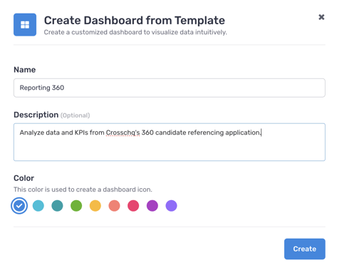
A window will appear where you can provide a title, description, and color for the new dashboard. Click Create once these fields have been entered.
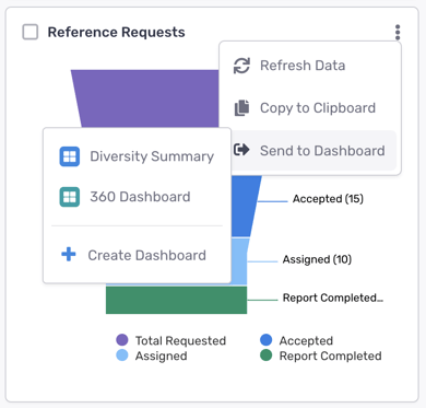
From an individual chart
A new dashboard can also be created by viewing an individual chart. Charts can be viewed from the library of the same name on the left-hand menu.

Clicking this section will open up the library of charts that are accessible to your org. On any chart, click the vertical ellipsis in the top-right corner, and select Send to Dashboard. You will be given the option to either create a new dashboard to store the chart or add the chart to an existing dashboard.
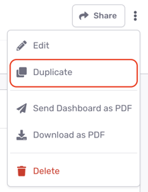
From an existing dashboard (duplicating)
To create an exact copy of another dashboard you have access to, click the vertical ellipsis at the top-right corner of the dashboard and select the duplicate option.
Dashboard homepage
Dashboards are organized on your homepage by the following tabs:
All - all dashboards that have been created by you or shared by other users
Starred - all dashboards that you have "bookmarked" with a star symbol

Created by me - all dashboards that were created from your account
Shared with me - all dashboards that other users have shared with you
Chart features
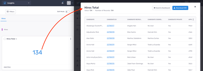
Drill-down modals
Within the displayed KPI of each individual chart, you can click into each metric to open a drill-down modal. The modal returns a table of records that have been factored into the KPI.
The tables can be edited to show or remove specific ATS columns. First, scroll to the very right of the table, click the vertical ellipsis, and select Edit columns.

A window will appear where you can add or remove the columns in the table.
 Tables can also be configured as their own "widget" if you prefer to view them directly on your dashboard (versus having to click the chart KPI). When a drill-down modal is open, click the Send to dashboard button at the top of the page.

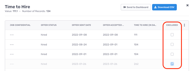
Time-to metric exclusions
On "time-to" charts (e.g. Time to Hire, Time to Fill), if there are outliers that you would like to omit from your calculations, you can exclude the record from the drill-down modal.
Distributing individual charts
Charts can be copied as an image and shared outside of Crosschq. Click the vertical ellipsis at the top-right corner of each chart to share either via email (the Send button) or copy feature.

Trending data
Click the menu icon to surface trending data on your chart:

The Trend feature compares the chart's KPI stat across the same filter criteria and date range from the previous year.

The Trendline feature displays a month-over-month line graph covering the chart's data.

The Target feature allows you to set a linear target value to be tracked against your chart's trendline.

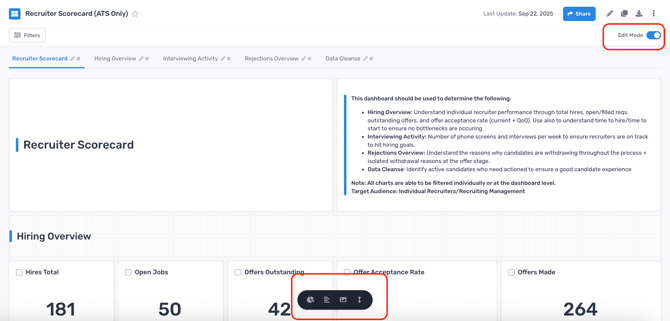
Chart editing
When Edit mode is enabled on a dashboard, you can further customize individual charts by either duplicating, renaming, or removing them from your dashboard. Edit mode must be turned on in order to see these features.

Dashboard features
This section will outline different tools to further customize your dashboards.
Filters
There are 4 ways that you can filter charts on your dashboard.
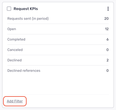
- Filter by single chart - every chart has its own filter parameters that you can edit by clicking the Add Filter button at the bottom left of the chart. This filter will only get applied to the individual widget and not affect data from other charts in the dashboard.
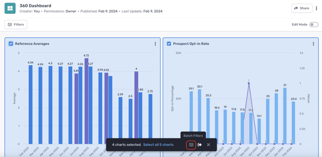
- Batch filtering of multiple charts - if there are multiple charts on a dashboard where you want to apply the same filter, you can do this by checking the box at the top-left of each widget. Afterward, a toolbar will appear below your screen. Click the slider icon to apply filters to all of the pre-selected charts.
When filters have been applied to charts either individually or via batch filtering, the bottom of each chart will display the number of filters in use. Hovering over this number will expose which filters are being applied.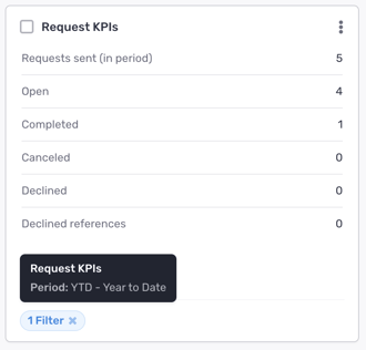
Note - When you use batch filtering, the filters you apply replace all previously applied filters that were on the selected widgets. - Use filter presets - users can create groups of filters (presets) that save them time when applying multiple filters across dashboards. Presets are not shared between users; each user has their own set of presets.
To create a preset, select one or more filters and then click Save as New Preset.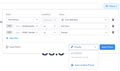
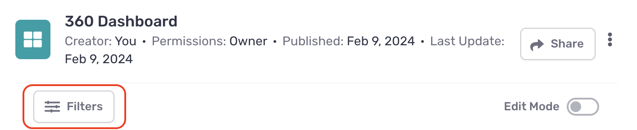
To apply the preset, select it from the dropdown list. This works at both the dashboard and chart levels. - Override filters - override filters can be applied from the top of your dashboard by clicking the Filters button below your dashboard name.
 When overrides are applied, they will be listed adjacent to the filter override button.
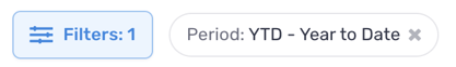 Note - override filters will apply to all charts in your dashboard where the same filter categories have not been stored at the individual level. The filters applied on an individually saved widget will take precedence over the override filters.
If a chart has been sent to a dashboard while filters were already applied to the chart, the chart on the dashboard will inherit these filters as its default filter settings.
Filters are organized into 3 different categories:
- Pre-Hire filters will originate from an ATS integration
- Post-Hire filters will originate from an HRIS integration
- Voice filters will originate from the Crosschq Voice app
Sharing dashboards
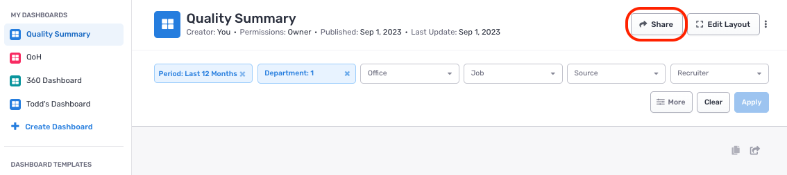
Dashboards can be shared with other Crosschq users in your org. On the dashboard that you want to share with another user, click the Share button at the top of the page.
From the Share menu, you can manage access to the dashboard, send a copy as a PDF, or schedule sending.

Manage Access:
From the Manage Access view, you manage the permissions for all users who can access the dashboard.

View-enabled permissions grant read-only access to the dashboard.
Edit-enabled permissions allow the user to edit the dashboard filters and layout.
View and Edit-enabled permissions allow the user to apply filters at the dashboard and chart levels.
Filters applied by users with View and Edit permission are private and do not affect other users' views of the dashboard.
Collaborators will receive an email once a new dashboard has been shared with them.
If a user with edit permissions changes the individual filter settings or dashboard layout, these changes will be reflected in all user accounts where the dashboard is shared. A notification will appear in the viewer’s dashboard stating: An editor has applied new filters to this dashboard.
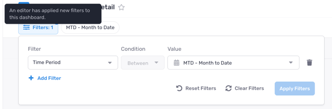
The user can apply the new filters by clicking Reset Filters, which replaces any filters they have currently applied with the editor’s filters.
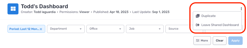
To unsubscribe to a dashboard that was shared with you, click the ellipsis at the top right corner and select Leave Shared Dashboard.
Send a Copy:
This option enables users to send a copy of the dashboard as a PDF, via email or Slack.

Schedule sending:
This option allows you to send daily/weekly/monthly pdf dashboards via email.
Editing dashboards
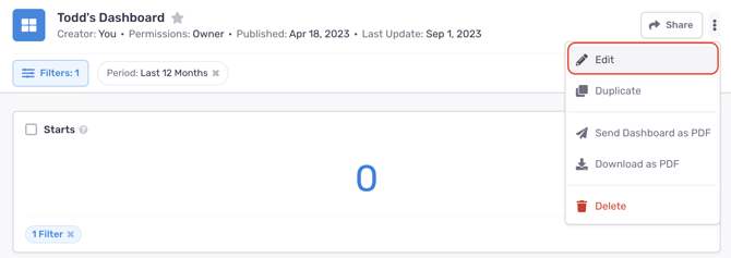
To edit the name or color of your dashboard, click the ellipsis at the top-right corner and select Edit.
To edit the layout of your dashboard, first toggle on Edit Mode. Once Edit Mode is enabled, you have the ability to move and/or resize the widgets in your dashboard.
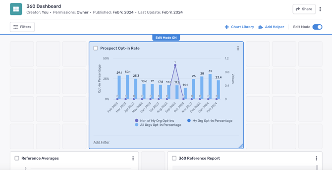
If the hand cursor appears over a chart, this means you can click and hold the chart to move it to another area of the dashboard.
Charts can also be resized from the bottom right corner of the chart.
When Edit Mode is on, additional options appear at the bottom of the page, allowing you to organize your dashboard with extra text, images, or spacing.
Once you are finished with your layout changes, turn Edit Mode off to save your changes.
Removing null values
While Edit Mode is enabled, you can turn on the ability to hide the groupings in your bar charts that return no data. This setting can be enabled across your entire dashboard when clicking the vertical ellipsis at the top-right corner of your dashboard.

When this dashboard-level toggle is disabled, you can choose to turn on this setting on individual charts.

Employee profiles and data import
Read the following articles to learn about: